

How lucrative stocks are in the long run is not only dependent on the length of the investment period but even more on the actual date the investment starts and ends!
Return Triangle Plots are a great way to visualize this phenomenon. If you want to learn more about them and how to create them with R read on!
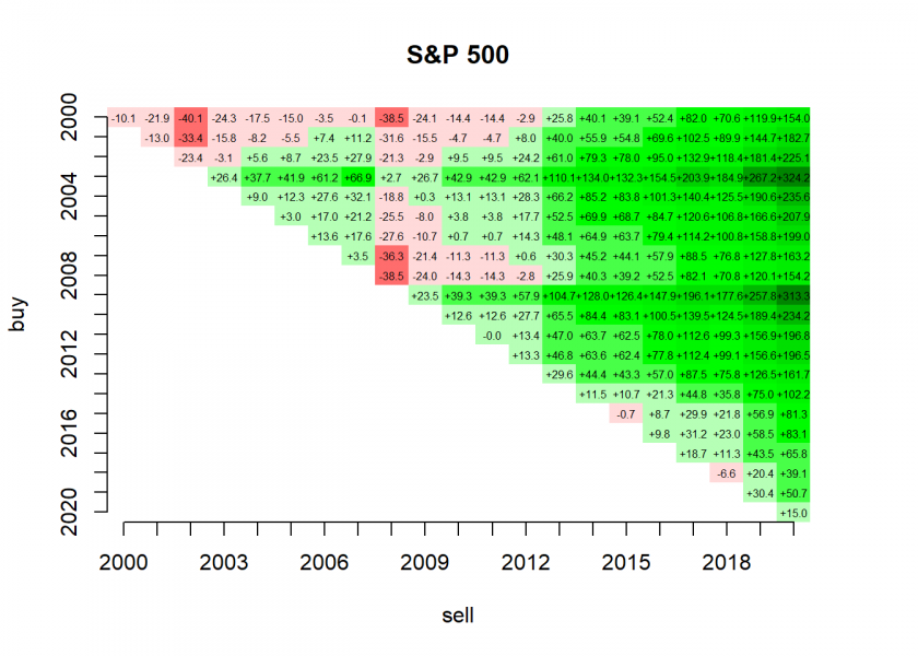
If you had invested in the Standard & Poors 500 index beginning of 2000 you would have had to wait 14 years until you were in the plus! The reason was, of course, the so-called dot-com bubble which was at its peak then and crashed soon afterwards. On the other hand, if you had invested in the same index beginning of 2003 you would have never had any loss below your initial investment and would have a return of more than 300% by now!
Return triangle plots are a great way to get to grips with this. The following function returns a return triangle for any ticker symbol (Symbol) for any start (from) and end year (to). For retrieving the stock or index data we use the wonderful quantmod package (on CRAN):
library(quantmod)
## Loading required package: xts
## Loading required package: zoo
##
## Attaching package: 'zoo'
## The following objects are masked from 'package:base':
##
##     as.Date, as.Date.numeric
## Loading required package: TTR
## Registered S3 method overwritten by 'quantmod':
##   method            from
##   as.zoo.data.frame zoo
## Version 0.4-0 included new data defaults. See ?getSymbols.

return_triangle <- function(Symbol = "^GSPC", from = 2000, to = 2020) {
  symbol <- getSymbols(Symbol, from = paste0(from, "-01-01"), to = paste0(to, "-12-31"), auto.assign = FALSE)
  symbol_y <- coredata(to.yearly(symbol)[ , c(1, 4)])
  from_to <- seq(from, to)
  M <- matrix(NA, nrow = length(from_to), ncol = length(from_to))
  rownames(M) <- colnames(M) <- from_to

  for (buy in seq_along(from_to)) {
    for (sell in seq(buy, length(from_to))) {
      M[buy, sell] <- (symbol_y[sell, 2] - symbol_y[buy, 1]) / symbol_y[buy, 1]
    }
  }
  round(100 * M, 1)
}

rt <- return_triangle(from = 2009, to = 2020)
## 'getSymbols' currently uses auto.assign=TRUE by default, but will
## use auto.assign=FALSE in 0.5-0. You will still be able to use
## 'loadSymbols' to automatically load data. getOption("getSymbols.env")
## and getOption("getSymbols.auto.assign") will still be checked for
## alternate defaults.
##
## This message is shown once per session and may be disabled by setting
## options("getSymbols.warning4.0"=FALSE). See ?getSymbols for details.

print(rt, na.print = "")
##      2009 2010 2011 2012  2013  2014  2015  2016  2017  2018  2019  2020
## 2009 23.5 39.3 39.3 57.9 104.7 128.0 126.4 147.9 196.1 177.6 257.8 313.3
## 2010      12.6 12.6 27.7  65.5  84.4  83.1 100.5 139.5 124.5 189.4 234.2
## 2011            0.0 13.4  47.0  63.7  62.5  78.0 112.6  99.3 156.9 196.8
## 2012                13.3  46.8  63.6  62.4  77.8 112.4  99.1 156.6 196.5
## 2013                      29.6  44.4  43.3  57.0  87.5  75.8 126.5 161.7
## 2014                            11.5  10.7  21.3  44.8  35.8  75.0 102.2
## 2015                                  -0.7   8.7  29.9  21.8  56.9  81.3
## 2016                                         9.8  31.2  23.0  58.5  83.1
## 2017                                              18.7  11.3  43.5  65.8
## 2018                                                    -6.6  20.4  39.1
## 2019                                                          30.4  50.7
## 2020                                                                15.0
The rows represent the buy dates (beginning of the respective year), the columns the sell dates (end of the respective year). To create a return triangle plot out of that data we use the fantastic plot.matrix package (on CRAN):
library(plot.matrix)
rt <- return_triangle(from = 2000, to = 2020)
bkp_par <- par(mar = c(5.1, 4.1, 4.1, 4.1)) # adapt margins
plot(rt, digits = 1, text.cell = list(cex = 0.5), breaks = 15, col = colorRampPalette(c("red", "white", "green1", "green2", "green3", "green4", "darkgreen")), na.print = FALSE, border = NA, key = NULL, main = "S&P 500", xlab = "sell", ylab = "buy")
par(bkp_par)
As it stands some care needs to be taken with setting the breaks and col arguments when creating your own triangle plots. It might help to remove key = NULL so that you can see in the legend whether values below zero are in red and above in green. If you know some elegant method to set those values automatically please share it with us in the comments below. I will update the post with an honourable mention of you!
Back to the triangle plot itself: you can clearly see how whole periods form clusters of positive and negative returns… like a heat map with green hills and red valleys.
In the long run, all investments get into the green but with huge differences of sometimes several hundred percentage points! So even for long-term investors timing indeed is important but as every quant knows unfortunately very, very hard (if not outright impossible).