
Customer Relationship Management (CRM) is not only about acquiring new customers but especially about retaining existing ones. That is because acquisition is often much more expensive than retention. In this post, we learn how to analyze the reasons of customer churn (i.e. customers leaving the company). We do this with a very convenient point-and-click interface for doing data science on top of R, so read on!
The most popular Graphical User Interface (GUI) for R is of course RStudio, but there are other interfaces as well. If you fear the terror of the blank screen you can use the very convenient and sophisticated data science GUI Rattle. Under R you just install rattle (on CRAN), it might be that you have to install the RGtk2 package too (also on CRAN). After that you load it with library(rattle) and start it with rattle():
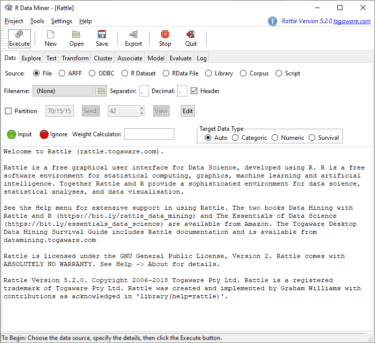
The dataset we will be using is from the new excellent book Quantitative Methods for Management. A Practical Approach (Authors: Canela, Miguel Angel; Alegre, Inés; Ibarra, Alberto) and publicly available, you can load the data directly from the Github repository churn.csv and save it to a directory of your choice.
The data set is a random sample of 5,000 customers of a mobile phone services company with the following attributes:
ID, a customer ID (the phone number).
ACLENGTH, the number of days the account had been active at the beginning of the period monitored (September 30th).
INTPLAN, a dummy for having an international plan during at least one month of the third quarter.
DATAPLAN, the same for a data plan.
DATAGB, the data allowance of the data plan (either 0, 100M, 250M, 500M, 1G, 1.5G or 2G).
OMMIN, the total minutes in calls to Omicron mobile phone numbers during the third quarter.
OMCALL, the total number of calls to Omicron mobile phone numbers during the third quarter.
OTMIN, the total minutes in calls to other mobile networks during the third quarter.
OTCALL, the total number of calls to other networks during the third quarter.
NGMIN, the total minutes in calls to non-geographic numbers, typically used by helplines and call centers, during the third quarter.
NGCALL, the total number of calls to non-geographic numbers during the third quarter.
IMIN, the total minutes in international calls during the third quarter.
ICALL, the total number of international calls during the third quarter.
CUSCALL, the total number of calls to the customer service, up to September 30th.
CHURN, a dummy for churning during the period monitored.
The last attribute CHURN is the target variable we want to predict. The tabs of the interface of Rattle are ordered according to a typical data science workflow. First we are going to load the data set by clicking on the directory symbol and selecting the file churn.csv where we saved it. After that we click on Execute:
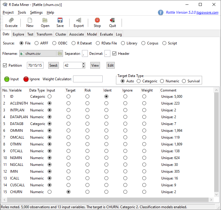
CHURN is correctly identified as Target. First we want to get some overview of the data. We switch to the tab Explore and select Box Plot and Histogram under Distributions for the first two variables (for illustrative purposes only two in this case):
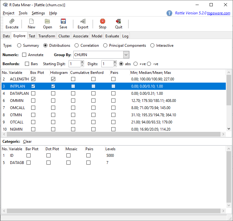
To get the same result deactivate Advanced Graphics under Settings in the menu and click on Execute:
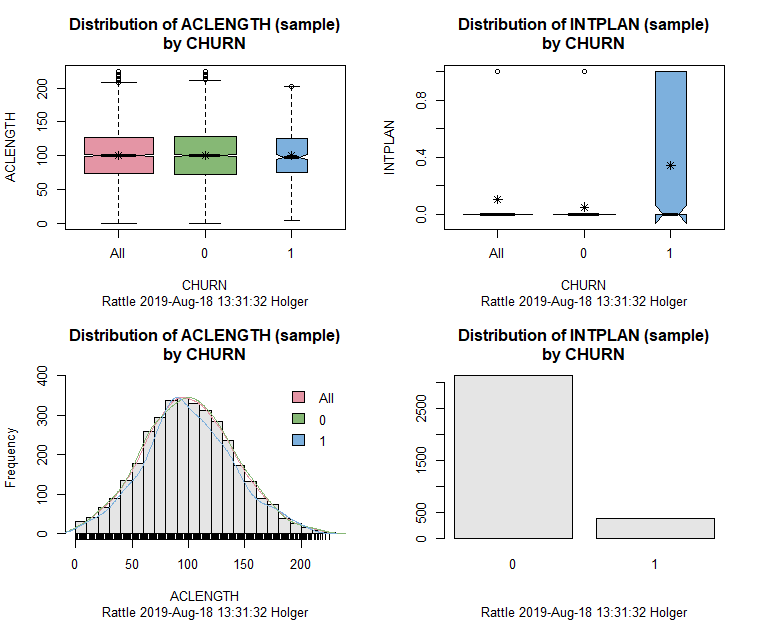
We can clearly see that the number of days the account had been active at the beginning of the period monitored (ACLENGTH) has almost no power to predict CHURN while INTPLAN (a dummy for having an international plan during at least one month of the third quarter) clearly has. It seems that customers are especially dissatisfied with this plan and are a lot more likely to churn. There is a lot of more information contained in those graphics but that is beyond the scope of this post.
We also test the categorical variable DATAGB (i.e. the data allowance of the data plan, either 0, 100M, 250M, 500M, 1G, 1.5G or 2G) by clicking Box Plot, Dot Plot and Mosaic and Execute again after that:
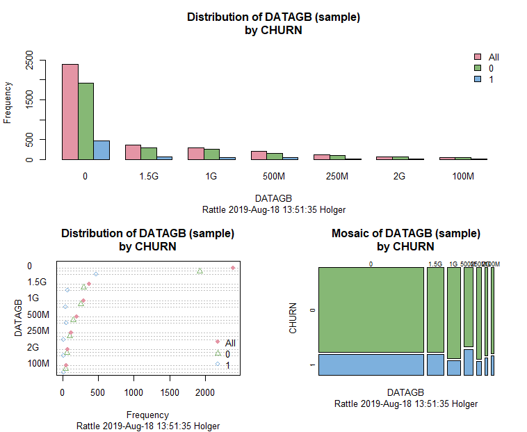
Again, it doesn’t seem that DATAGB can do anything useful for us (this can e.g. be seen well in the mosaic plot where the proportions for CHURN stay more or less the same). Now, we want to build a real data science model, a decision tree, which has the advantage of a good interpretability. For that matter we switch to the Model tab and just click on Execute:
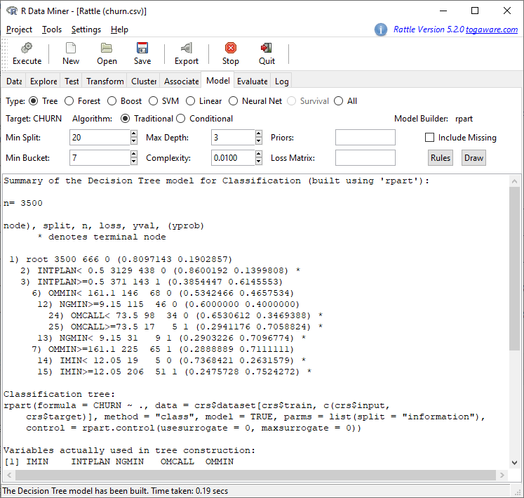
The result is not very readable, we want a clearer representation as a tree diagram. For that matter we activate Advanced Graphics again and click on Draw and the following tree should appear (in case that it only occupies the upper half of the whole area please use the following piece of code to reset the tiling to one row and one column only: par(mfrow = c(1, 1))):
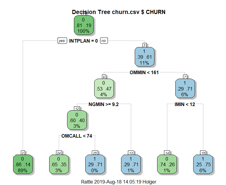
We can see that customers with no international plan have a very low probability of churning while with customers with such a plan it depends on other variables whether they will churn or not. We can get the exact rules by clicking on Rules:
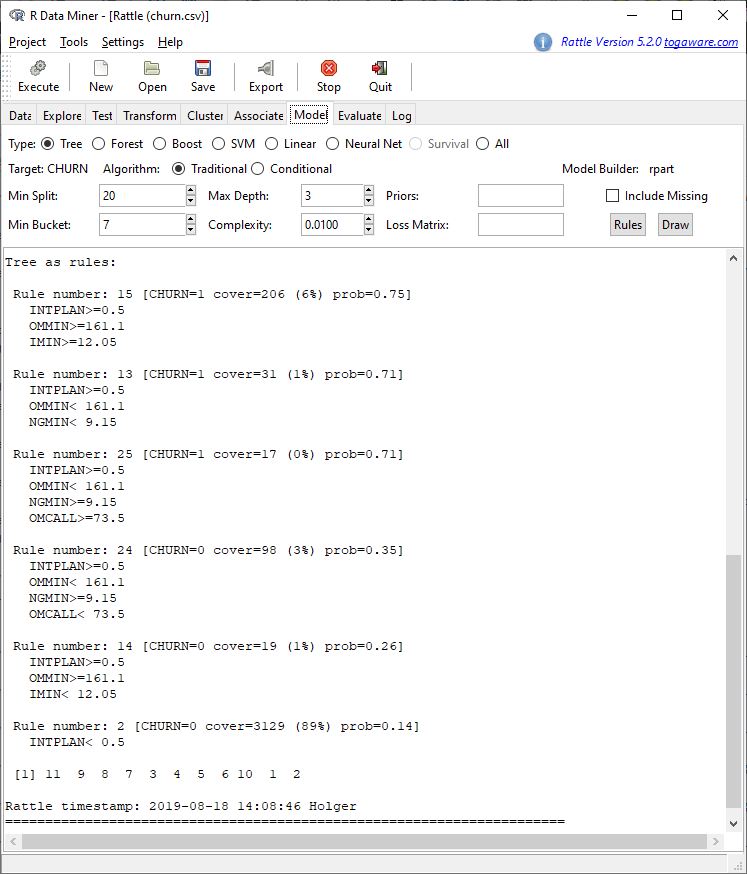
In a real data science project, the marketing team would now go through all those rules to see whether they make sense and whether additional actions can be inferred. For example rules 14 and 15 in combination might be interesting: in both rules customers have an international plan, yet the one group doesn’t really need it which leads to their not churning while the other group who uses it churns with high probability (remember IMIN is the total minutes in international calls). This could mean that the plan as such is not perceived as bad but that there might be some problems in its operation… in any case, this warrants further investigation!
As a last step we want to check the quality of our model. We switch to the tab Evaluate and click on Testing and Execute:
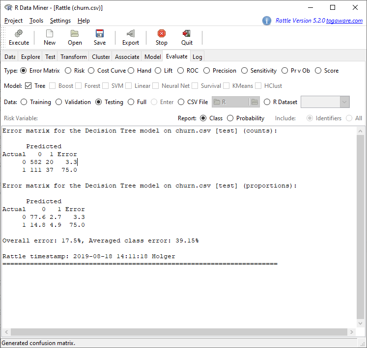
We see that by using this tree model we e.g. have an overall error of 17.5%, which is not too bad. We can try to drive this error rate further down by building more sophisticated models in the Model tab, like Random Forest, Boost, SVM (for Support Vector Machine) and a Neural Net. We will not go into those here but you can read more about some of them in these posts:
- Learning Data Science: Predicting Income Brackets
- Understanding AdaBoost – or how to turn Weakness into Strength
- Understanding the Magic of Neural Networks
In a practical setting, it might also be that it is more expensive to lose a customer who was predicted to stay than to keep a customer who was predicted to churn. In the first case, you lose a whole customer and all of her revenue, in the second case you might only have offered a better plan with a smaller profit margin. Different models will make different kinds of errors, it depends on the setting which errors are preferable.
One very nice feature of Rattle is that your whole session is being recorded as real, executable R code. You can use that to see what is really going on under the hood and to reproduce and reuse your analyses! Just go to the last tab Log:
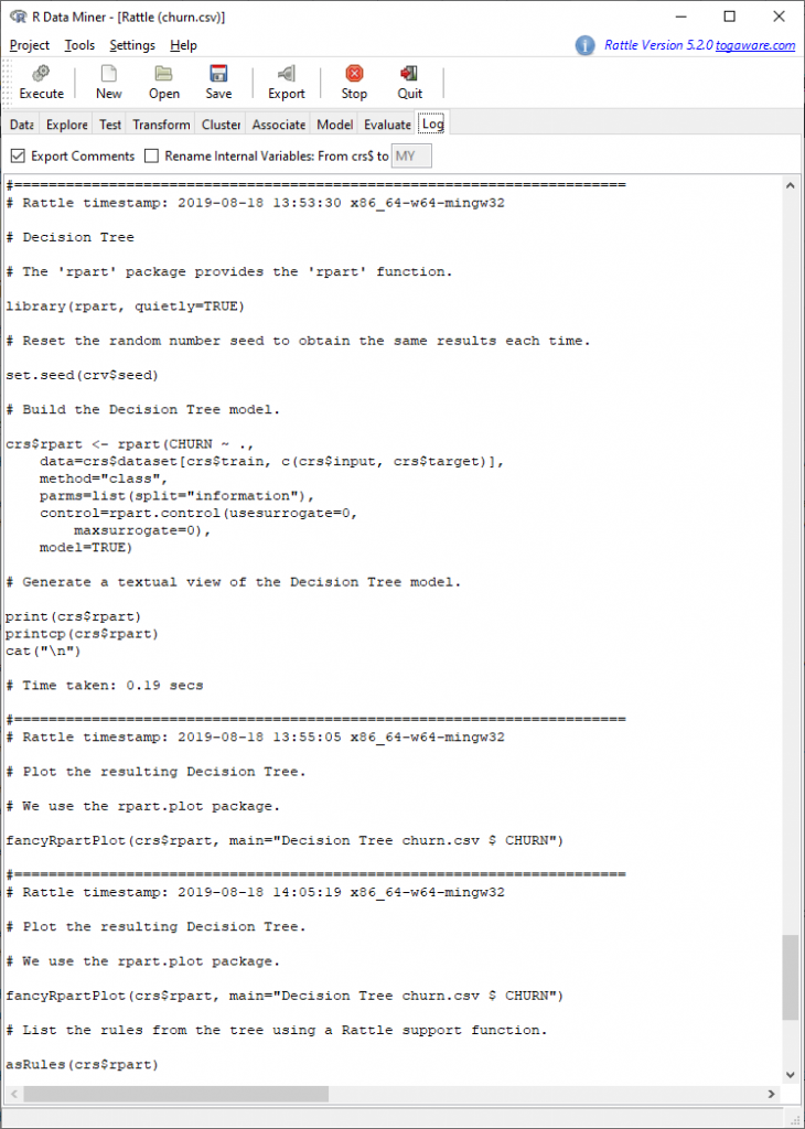
You can export the whole script by just clicking Export.
To conclude this post, as a sanity check and benchmark we let the data set run through the OneR package (on CRAN, for more info see also the vignette):
library(OneR)
#churn <- read.csv("https://raw.githubusercontent.com/quants-book/CSV_Files/master/churn.csv")
churn <- read.csv("data/churn.csv")

data <- maxlevels(optbin(churn))
## Warning in optbin.data.frame(churn): target is numeric

model <- OneR(data, verbose = TRUE)
##
##     Attribute Accuracy
## 1 * INTPLAN   83.38%
## 2   ACLENGTH  80.64%
## 2   DATAPLAN  80.64%
## 2   DATAGB    80.64%
## 2   OMMIN     80.64%
## 2   OMCALL    80.64%
## 2   OTMIN     80.64%
## 2   OTCALL    80.64%
## 2   NGMIN     80.64%
## 2   NGCALL    80.64%
## 2   IMIN      80.64%
## 2   ICALL     80.64%
## 2   CUSCALL   80.64%
## ---
## Chosen attribute due to accuracy
## and ties method (if applicable): '*'

summary(model)
##
## Call:
## OneR.data.frame(x = data, verbose = TRUE)
##
## Rules:
## If INTPLAN = 0 then CHURN = 0
## If INTPLAN = 1 then CHURN = 1
##
## Accuracy:
## 4169 of 5000 instances classified correctly (83.38%)
##
## Contingency table:
##      INTPLAN
## CHURN      0     1  Sum
##   0   * 3839   193 4032
##   1      638 * 330  968
##   Sum   4477   523 5000
## ---
## Maximum in each column: '*'
##
## Pearson's Chi-squared test:
## X-squared = 712.58, df = 1, p-value < 2.2e-16

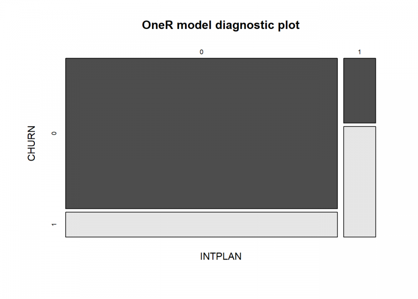
plot(model)
prediction <- predict(model, data)
eval_model(prediction, data)
##
## Confusion matrix (absolute):
##           Actual
## Prediction    0    1  Sum
##        0   3839  638 4477
##        1    193  330  523
##        Sum 4032  968 5000
##
## Confusion matrix (relative):
##           Actual
## Prediction    0    1  Sum
##        0   0.77 0.13 0.90
##        1   0.04 0.07 0.10
##        Sum 0.81 0.19 1.00
##
## Accuracy:
## 0.8338 (4169/5000)
##
## Error rate:
## 0.1662 (831/5000)
##
## Error rate reduction (vs. base rate):
## 0.1415 (p-value = 3.256e-07)
Again, the problem with the international plan is corroborated with high accuracy…
Dear Marketing team: Immediate action is required!

Am I the only one to think this is a really bad model?
If I have no model and just blankly predict everyone being 0 (not churned), my error rate is 14.8%+4.9%=19.7%!
Comparing this with the 17.5% prediction error, and you are trying to sell me this is a good model?
What’s worse is someone could use this model to make actual business decisions!
Please think about what you are doing before employ “data science”!
Thank you for your comment. Talking about the OneR model: compared to ZeroR (the base rate you are referring to) the error rate reduction is over 14% and highly significant. Admittedly, this is not a great model but one you can get instantly out of the box. As I write in the post, you have to look into the matter more thoroughly.
Concerning the base rate, you are right: you always have to keep this in mind. In a later post I will address this issue, so stay tuned!
Well yes of course the model doesn’t predict all cases and there is some error. But it is a great start and as a business person much better to act on its intuitions than just randomly guess who the ~20% are.
I actually took another run at the data using R & CHAID.
https://ibecav.netlify.com/post/analyzing-churn-with-chaid/
Accuracy isn’t any better but hopefully you can see how the model insights are helpful. You could try and newer more aggressive tool like xgboost and probably get a few more percentage points of accuracy, but the bottom line is sometimes you can’t build a model that is as accurate as one would like.
Thank you, Chuck, for your comment and your great article. Much appreciated!
Can you please help me:
How can I understand “All” , “1” and “0” in the first two results?
Thank you.
” … with such a plan it depends on other variables …”
“yes” in the decision tree means with the INPLAN, right?
And on this side there are no variabbles which influnce the probability.
I guess, you wanted to say ” …without such a plan, the probability depends on other variables… ”
for the first tree branch “no” i.e. “1” going to rule 3.
I think I understand, here “yes” means INPLAN=0, i.e. no plan. If no international plan, the probability of churn is just 14%, with such a plan probability=61%. So, all is right in the text.
What is the number meaning on the top left in the box on the decision tree? for example 0.81, 0.86, 0.39 ?
The two numbers are the probabilities for each class, so in this case “no churn” and “churn”.
The “yes” refers to INTPLAN = 0, so no int. plan… it is a little confusing, I agree but everything is fine as it stands.