

One widely used graphical plot to assess the quality of a machine learning classifier or the accuracy of a medical test is the Receiver Operating Characteristic curve, or ROC curve. If you want to gain an intuition and see how they can be easily created with base R read on!
Many machine learning classifiers give you some kind of score or probability of the predicted class. One example is logistic regression (see also Learning Data Science: The Supermarket knows you are pregnant before your Dad does). If we had a perfect (binary) classifier the true (actual) classes (C), ordered according to the values of the score of the classifier (Score), would show two distinct blocks of the true positive classes (P) and the true negative classes (N):
(perfect <- data.frame(C = c(rep("P", 10), c(rep("N", 10))), Score = seq(0.95, 0, -1/20)))
##    C Score
## 1  P  0.95
## 2  P  0.90
## 3  P  0.85
## 4  P  0.80
## 5  P  0.75
## 6  P  0.70
## 7  P  0.65
## 8  P  0.60
## 9  P  0.55
## 10 P  0.50
## 11 N  0.45
## 12 N  0.40
## 13 N  0.35
## 14 N  0.30
## 15 N  0.25
## 16 N  0.20
## 17 N  0.15
## 18 N  0.10
## 19 N  0.05
## 20 N  0.00
On the other hand the ordered scores of a completely useless classifier would give some arbitrary distribution of the true classes:
(useless <- data.frame(C = c(rep(c("P", "N"), 10)), Score = seq(0.95, 0, -1/20)))
##    C Score
## 1  P  0.95
## 2  N  0.90
## 3  P  0.85
## 4  N  0.80
## 5  P  0.75
## 6  N  0.70
## 7  P  0.65
## 8  N  0.60
## 9  P  0.55
## 10 N  0.50
## 11 P  0.45
## 12 N  0.40
## 13 P  0.35
## 14 N  0.30
## 15 P  0.25
## 16 N  0.20
## 17 P  0.15
## 18 N  0.10
## 19 P  0.05
## 20 N  0.00
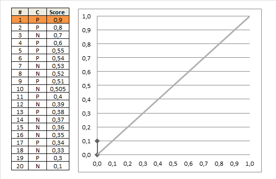
As a third example let us take the ordered scores of a more realistic classifier and see how the true classes are distributed:
(realistic <- data.frame(C = c("P", "P", "N", "P", "P", "P", "N", "N", "P", "N", "P", "N", "P", "N", "N", "N", "P", "N", "P", "N"),
                         Score = c(0.9, 0.8, 0.7, 0.6, 0.55, 0.54, 0.53, 0.52, 0.51, 0.505, 0.4, 0.39, 0.38, 0.37, 0.36, 0.35, 0.34, 0.33, 0.3, 0.1)))
##    C Score
## 1  P 0.900
## 2  P 0.800
## 3  N 0.700
## 4  P 0.600
## 5  P 0.550
## 6  P 0.540
## 7  N 0.530
## 8  N 0.520
## 9  P 0.510
## 10 N 0.505
## 11 P 0.400
## 12 N 0.390
## 13 P 0.380
## 14 N 0.370
## 15 N 0.360
## 16 N 0.350
## 17 P 0.340
## 18 N 0.330
## 19 P 0.300
## 20 N 0.100
To get some handle on the quality of classifiers (and medical tests) two measures are widely used:
- Sensitivity or True Positive Rate (TPR): the proportion of actual positives that are correctly identified as such (e.g. the percentage of sick people who are correctly identified as having the condition).
- Specificity or True Negative Rate (TNR): the proportion of actual negatives that are correctly identified as such (e.g. the percentage of healthy people who are correctly identified as not having the condition).
ROC curves plot both of those measures against each other! More concretely, it goes along the ordered scores and plots a line up for a true positive example and a line to the right for a true negative example (for historical reasons not the True Negative Rate (TNR) but the False Positive Rate (FPR) is being plotted on the x-axis. Because FPR = 1 – TNR the plot would be the same if the x-axis ran from 1 to 0.).
Let us first create a small function for plotting the ROC curve and try it with our “perfect” classifier:
roc <- function(x) {
  Labels <- ifelse(x$C[order(x$Score, decreasing = TRUE)] == "P", TRUE, FALSE)
  plot(data.frame(FPR = c(0, cumsum(!Labels) / sum(!Labels)), TPR = c(0, cumsum(Labels) / sum(Labels))), type = "o", pch = 18, xlim = c(0, 1), ylim = c(0, 1))
  lines(c(0, 1), c(0, 1), lty = 2)
}
roc(perfect)
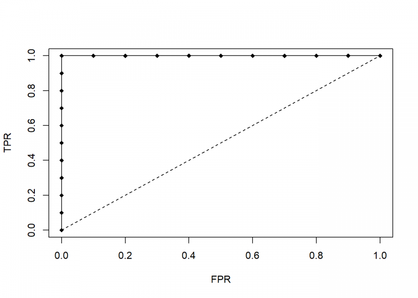
Because all of the first examples are true positive examples the line goes all the way up and when it reaches the middle (the threshold) it goes all the way to the right: a perfect classifier.
Let us now plot our completely useless classifier:
roc(useless)
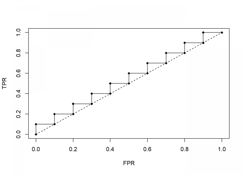
As can be seen, the useless classifier runs along the diagonal line from (0, 0) to (1, 1). The better a classifier the more it looks like a turned around “L”, the worse the more it looks like this diagonal line.
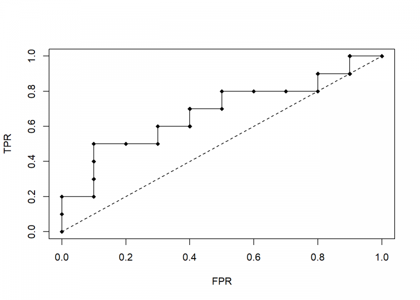
Realistic cases are between those two extremes:
roc(realistic)
To summarize have a look at the following animation which builds the last plot step by step:
There would be much more to say about concepts like Area Under the Curve (AUC), finding the optimal threshold (“cutoff” point) for the scores and more performance measures but this will have to wait for another post, so stay tuned!
Tanks for posting!
You are very welcome!