

It’s a widely accepted notion that money influences happiness, a concept famously associated with Nobel laureate Daniel Kahneman, who purportedly demonstrated that emotional wellbeing increases with income but plateaus beyond an annual threshold of about $75,000.
This idea has permeated both academic circles and popular media, reinforcing the belief that there’s a direct correlation between financial prosperity and happiness. But how accurate is this belief when we scrutinize the data more closely? To find out read on!
Recent research (indeed the last paper ever published by Kahneman!) attempts to delve deeper into this relationship, suggesting that the connection between income and happiness is real and relevant. However, a closer examination of the publicly available data tells a different story.
My own analysis reveals a Pearson correlation coefficient of just 0.07 between wellbeing and income, indicating a very weak relationship despite its statistical significance:
data <- read.csv("Data/Income_and_emotional_wellbeing_a_conflict_resolved.csv") # modify path accordingly
data$income_factor <- factor(data$income, levels = sort(unique(data$income)))

cor.test(data$wellbeing, data$income)
##
##  Pearson's product-moment correlation
##
## data:  data$wellbeing and data$income
## t = 13.293, df = 33389, p-value < 2.2e-16
## alternative hypothesis: true correlation is not equal to 0
## 95 percent confidence interval:
##  0.06187719 0.08321620
## sample estimates:
##      cor
## 0.072555
One of the more subtle learnings of academic research is that a relationship between two variables can statistically be highly significant while in practice being useless because the effect is so minuscule. Paradoxically, the more data points you have the higher the chances that you will find something statistically significant that has no practical significance.
In this case we have more than 33,300 data points and while there is a tiny increase in happiness with greater income, the effect is so slight that its real-world implications are negligible. Indeed, the difference between the medians of happiness at household incomes of $15,000 and $250,000 is only about five points on a 100-point scale!
To put the observed effect into a more relatable context, consider this: the difference in happiness resulting from an approximately fourfold difference in income is roughly equivalent to the happiness boost one might feel over a typical weekend! This comparison starkly illustrates the insignificance of income effects relative to everyday life experiences.
Yet this research manages to persuade us that there is indeed something substantial going on. How is this achieved in such studies? The devil is in the details, or in this case, the methodology. Three statistical choices in such studies stand out as particularly problematic: the logarithmic transformation of income, the use of z-scores and the use of averages without referring to dispersion measures for wellbeing:
- Logarithmic transformation: By transforming income using a logarithmic scale, the data suggest a linear relationship where none exists. This transformation masks the reality of diminishing returns, where increases in income result in progressively smaller gains in happiness. These methods, while often applied in practice for reducing skewness, can present a distorted view of the underlying data. Apart from that, how should one interpret “log income” anyway?
- Z-scores: The application of z-scores is another area where the graphical representation can be misleading. Z-scores standardize data points and effectively cut off the y-axis of the original data, which can visually exaggerate minor differences. When we depict wellbeing scores on a complete 0-100 scale, the supposed effect of income on happiness nearly vanishes, revealing a much less compelling story.
- Averages without dispersion measures: While using median values (or means) is not problematic per se, it can mask the inherent dispersion of the data, e.g. to be indicated by interquartile ranges (IQR), standard deviations, variances, or confidence intervals. Especially when data is extremely dispersed, as in this case with wellbeing, interpreting results and drawing meaningful conclusions can be challenging without proper context.
The plots I’ve created from the original data starkly illustrate these points. I often start my own data analyses with a scatter plot but in this case, I first thought that I made a mistake or got the wrong data:
plot(data$wellbeing ~ data$income,
     main = "Scatterplot of Wellbeing Across Income Levels",
     xlab = "Income", ylab = "Wellbeing")
grid()

This plot shows a dense cluster of data points that scatter broadly across the graph, displaying no apparent trend or meaningful pattern linking income to wellbeing.
But worry not, by making use of the three statistical techniques from above, it is quite easy to create plots like the ones shown in the pertinent literature:
mean_well_being_zscore <- aggregate(scale(wellbeing) ~ log_income, data = data, median)
plot(mean_well_being_zscore,
     main = "Z-Score of Median of Wellbeing Across Log-Income Levels",
     xlab = "Log Income", ylab = "Wellbeing (z-scored)",
     pch = 16)
grid()
LinReg <- lm(V1 ~ log_income, data = mean_well_being_zscore)
LinReg
##
## Call:
## lm(formula = V1 ~ log_income, data = mean_well_being_zscore)
##
## Coefficients:
## (Intercept)   log_income
##    -1.08108      0.09396

abline(LinReg)
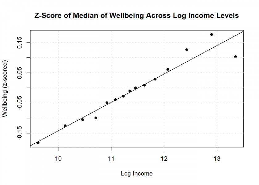
Mirroring Figure 1B from the above paper, this plot suggests a clear relationship between rising levels of income and resulting wellbeing. Alas, upon closer scrutiny, this proves to be more a product of clever statistical handling than any relevant effect.
Now let us have a look at some less sophisticated plots to see what is really going on… or better, “isn’t going on”. We recreate the same plot but this time without the log transformation of income and without z-scoring the wellbeing values:
mean_well_being <- aggregate(wellbeing ~ income, data = data, median)
plot(mean_well_being,
     main = "Median of Wellbeing Across Income Levels",
     xlab = "Income", ylab = "Wellbeing",
     pch = 16)
grid()

plot(mean_well_being,
     main = "Median of Wellbeing Across Income Levels",
     xlab = "Income", ylab = "Wellbeing",
     ylim = c(0, 100),
     pch = 16)
grid()

The first version of this plot artificially caps the y-axis to suggest a strong, meaningful relationship; the second version showing the full axis demonstrates the near absence of any real effect. In this case the manipulation of the y-axis becomes more apparent because we can now see the real wellbeing values instead of the hard to interpret z-scored ones.
And these plots do not deceive the eye, e.g. nearly doubling one’s income from $35,000 to $65,000 shows not even a statistically significant difference in the level of wellbeing:
t.test(data$wellbeing[data$income == 35000], data$wellbeing[data$income == 65000])
##
##  Welch Two Sample t-test
##
## data:  data$wellbeing[data$income == 35000] and data$wellbeing[data$income == 65000]
## t = -1.8237, df = 4923.9, p-value = 0.06825
## alternative hypothesis: true difference in means is not equal to 0
## 95 percent confidence interval:
##  -1.32549954  0.04789018
## sample estimates:
## mean of x mean of y
##  62.37602  63.01482
Or even more extreme, the effect of more than quadrupling one’s income from $137,500 to $625,000 isn’t statistically significant either:
t.test(data$wellbeing[data$income == 137500], data$wellbeing[data$income == 625000])
##
##  Welch Two Sample t-test
##
## data:  data$wellbeing[data$income == 137500] and data$wellbeing[data$income == 625000]
## t = -1.6919, df = 533.15, p-value = 0.09125
## alternative hypothesis: true difference in means is not equal to 0
## 95 percent confidence interval:
##  -2.4851637  0.1852509
## sample estimates:
## mean of x mean of y
##  64.19116  65.34111
In the last chart we now also add a measure of dispersion in the form of boxplots. Here it becomes even more clear that across income levels, wellbeing hardly changes and is extremely dispersed at that:
boxplot(wellbeing ~ sort(income_factor), data = data,
        main = "Boxplot of Wellbeing Across Income Levels",
        xlab = "Income", ylab = "Wellbeing",
        col = rainbow(length(unique(data$income))))

To be fair, the authors do briefly address some of these criticisms, but those discussions are buried deep within the paper and serve mainly to downplay their significance. It’s important to remember that “lying with statistics” doesn’t necessarily involve outright falsehoods; rather, it involves presenting results in a way that suggests misleading conclusions or exaggerates irrelevant findings.
As a sidenote, the possibility of reverse causality — where inherently happier individuals might earn more — should also be considered. It suggests that personal disposition (what self-proclaimed “life-coaches” call “mindset” nowadays!) might drive both happiness and higher income rather than the reverse. It would be interesting to see the results if you reversed both variables. Moreover, it would be insightful to examine how changes in income levels affect wellbeing, as the current research only addresses the wellbeing of individuals at their existing income levels.
To conclude, this critique is not just about debunking a popular myth; it’s a call for greater integrity and clarity in how statistical research is conducted and reported. I would be very interested in your feedback and in whether you have encountered similar overstatements in other research.
UPDATE April/May 2024
My post has garnered a lot of attention on LinkedIn and especially good feedback, some excerpts:
Professor Przemyslaw Biecek, Warsaw University of Technology:
A very nice data-drive discussion with the ‘Kahneman last paper’! Will share with my students
Adrian Olszewski, Biostatistician:
Absolute masterpiece – both side: in trying to “find a way to show something that doesn’t exist” and in revealing the sad truth 🙂 I saw several such “almost rectangular curtains” with a “jagged corner” which created spurious pattern (usually increasing), while actually nothing happened.
Adam Tarnawski, Senior Advanced Analytics Expert, Mercer:
That’s a good representation how data can be manipulated. Theres’ a bigger issue of replicability in social science and efforts how to address that. […] very good job. There should be an obligatory review by a statistician as part of the peer review process.
Dr Björn Walther, Consultant, YouTuber:
Well done! Straight to the point of how a simple manipulation of the y-axis of a graph and a few log transformations / z-standardizations will give the result one was (not) looking for.
Jan Eggers, Digital Journalist at Hessischer Rundfunk:
Already shared – and: I will definitely show this to my data journalism students today.
Dr Paul Bilokon, Quant of the Year 2023, Visiting Professor, Imperial College:
Interesting analysis.
Michael Srb, CFA, Expert in Quantitative Finance:
Great Article as always! With these type of questions you can go wrong in so many ways… especially after transforming data.
Robert D. Brown III, Author of “Business Case Analysis with R”:
This is a really interesting analysis. Thanks for sharing this. […] your article kicked off more focused thinking and reflection than any other LinkedIn post I’ve read recently. I really do appreciate that.
Bobby Markov, Senior Data Analyst, Ph.D. candidate:
I just love the Boxplot of Wellbeing Across Income Levels that was shown, such a clear message.
Lieber Holger, hervorragende Darstellung dieses wichtigen Themas. Ich befürchte trotzdem nur wenige werden den gesamten Text lesen, verstehen oder gar die Programme ausprobieren, auch wenn das der Vertrauenswürdigkeit Gewicht verleiht.
Ich selbst stand oft vor der Wahl, Entscheidungen via statistischer Auswertungen für Kunden zu finden (…oder vielmehr den favorisierten Kandidaten zu pushen). Dem konnte ich mit einem geeigneten Fragenkatalog entgegentreten, der sowohl den positiven Zusammenhang abfragt, als auch den negativen ausschließt, um einen realen Zusammenhang aufzuzeigen.
Im Beispiel des Titels gilt als statistisch relevant nicht nur der einseitige Zusammenhang des Glücks mit steigendem Einkommen, sondern gleichzeitig ist es auch der Nachweis des Unglücks bei sinkendem Einkommen, der erst den Zusammenhang belegt.
Ich hoffe damit einen Beitrag zu leisten, der nützlich sein soll, insbesondere, weil vielen diese Konstellation zum Nachweis eines Zusammenhangs völlig fremd ist. Einseitige Data Analytics reicht einfach nicht aus, es braucht den sachgerechten Nachweis positiv bestätigend als auch negativ ausschließend. Gruß Guido
Lieber Guido, vielen Dank für deinen Kommentar!
Was meinst du mit “positiv” und “negativ”? In diesem Falle ist die “Glücksskala” von 0 = “schwer depressiv” bis 100 = “himmelhoch jauchzend”. Es sind also beide Seite abgedeckt. Wenn das Einkommen steigt, geht es Richtung 100, wenn es fällt Richtung 0. Nur halt so minimal, dass es keine praktische Relevanz hat (im Bereich 61 – 66).
I do not think that log transforming income masks diminishing returns. Say your coefficient in
happiness ~ beta *log(income)is 1. That means if you double your income, happiness increases by 1. If you double your income again, it increases by 1. That is exactly what diminishing returns mean!I do think there is a meaningful effect of income on happiness. Imagine you move up from the lowest decile to the next or the next thereafter. You have much more possibilities, you likely worry much less.
However if you climb the income ladder further, higher income means more stress, more work, less time with your family. So I think you need to control for confounders like: Amount of hours worked, time with family.
Honestly I find your post a bit disturbing: Poor people likely benefit from income. Imagine you can not even afford enough food. Money certainly helps.
Thank you for your comment, huan.
I don’t think many people are accustomed to thinking in terms of mathematical functions like logarithms; when they see a straight line, they assume a linear relationship. I haven’t found a single article about this research that mentions “diminishing returns”. As I mentioned in my post, nobody understands what ‘log income’ is supposed to mean.
Disturbing? I didn’t create that data; I simply analyzed it in a less distorted manner. To be honest, I find it disturbing how the authors suggested interpretations that aren’t supported by the data. I won’t apologize if that contradicts some capitalist agenda that ever more money will make us happy.
Yes, thinking in logarithms is hard. I also made a mistake! I want to correct it:
Doubling your income does not mean happiness increases by 1. Instead, it increases by 0.69:
Say your model is happiness ~ beta * log(income), beta = 1. :
log usually means the natural logarithm ln() to the base e = exp(1).
But then doubling income won’t increase happiness by 1!
Instead ln(2 *income) = ln(2) + ln(income) = 0.69 + ln(income)
If happiness is to grow by exactly 1, we have to multiply income with e not 2:
ln(e *income) = ln(e) + ln(income) = 1 + ln(income)
Hey just a couple of comments.
1) “nobody understands what ‘log income’ is supposed to mean.”– Well economists (the target audience) do. Its something they teach. “A 1% change in income is associated with a beta/100 unit change in the y variable.” or “double your x, you get an effect of beta”, (now you know 🙂 )
2) Why use log income? Its not to “lie”, its a standard because of two things. (a) OLS (and the coefficient you calculate) is influenced by significant outliers, but wealth is super skewed because there are a few people that are extremely wealthy (pareto principle). See the problem? Extremely wealthy people are overly weighed in OLS when just regressing it to income [https://tillbe.github.io/outlier-influence-identification.html] . So basically a few rich people disproportionately influence your correlation coefficient. (b) Linear regression assumes linearity, but as another commenter has pointed out, economists expect diminishing returns to wealth. (SO ALL WEALTH EFFECTS ARE NONLINEAR). This is fixed by taking the log of x, which linearizes percent changes (as explained in 1), allowing use of good stats.
3) Finally, the T-tests. You are artificially increasing your confidence intervals by only using data with two values (values), one of them is really wierd “137500”? How many people reported their income at exactly 137500? There can’t be many observations with this, was that an arbitrary number, or did you pick it? Less points is increasing your confidence interval, increasing your p-val. But you can add information to improve your accuracy for the mean prediction for 137500, by considering the evidence of points near 137500, like 138000, which is only 500 dollars richer (think a laptop). This is what we get when we do regressions for mean predictions. Also the first t-test finds the same effect as the paper you cite, but they get tighter CI because they use all the information available.
Anyhow, I agree that the mean effect isn’t super strong. But no one variable is going to account for a lot of happiness, because happiness is super multivariate. Who you marry, the health of your family, your community, these are things that make people happy, and money can only help a little bit (but it DOES HELP). The research finds that money helps — to a point. Which is cool, because AD is saying that the uber rich really aren’t significantly happier on average than anyone else. Which rather than fuel a “capitalist agenda”, actually suggests that there is an ideal level of income policy makers should aim for, suggesting progressive tax schemes and more support for poor people go further in creating happiness than tax cuts to the rich.
The paper you cite has some other findings that aren’t so clear cut in how we should interpret them, but the fundamental idea that happiness is positively associated with happiness is really not in contention.
Thank you for your comments, Liam.
1) The target group isn’t economists, but psychologists as can be seen in the very first line of the paper: “Psychological and cognitive sciences”. I wouldn’t bet on it that those are familiar with the intricacies of economic models, but I am no psychologist. But even economists like me pay with Euros and not “log Euros” so it wouldn’t hurt to show at least one plot with income instead of log income to gain some intuition of what is really going on. As I have demonstrated above, it is quite easy to do that.
2) Yes, I see the problem, but the problem is not fixed by the transformation. You get a correlation of 0.09 (instead of 0.07) with log income which doesn’t solve anything. I agree with the part about assumptions; however, transformations to make your data fit the assumptions of a certain model are often inherently problematic for several reasons, but I will not elaborate on that here.
3) Yes, I agree, weird indeed. But, again, their data, not mine! “137,500” is one of the 15 distinct values for income (this one with 2,856 values for wellbeing). The others are:
Well, you see, your formulation “the mean effect isn’t super strong. But no one variable is going to account for a lot of happiness, because happiness is super multivariate. Who you marry, the health of your family, your community, these are things that make people happy, and money can only help a little bit” is super cool! I wish they had started their paper with something like that. That would be honest and accurate. You can do it, and they could have done it too. Problem solved.
What do you mean by “some other findings that aren’t so clear cut in how we should interpret them”. Some additional things I oversaw?
Thank you again for your comment.
Concerning the many other variables that account for happiness: I guess that when you control for them, income would become even more insignificant!
Fantastic article, thank you!
Thank you, Malcolm, I really appreciate it.
Great article, in my (humble statistician) opinion your points are well and clearly presented, which is why I am also a bit surprised about some of the backlash. My best guess is that your clarification collides with some people’s world view. 😉
Thank you for your great feedback, Roman!
One thing might be some hidden worldview/agenda, another might be that it has become an undisputed mantra that this relationship is significant since godfather Kahneman started preaching it. I believed this without questioning until I had a look at the data myself.
In this thread: nitpickers that ignore the fundamental problem:
Public readers such as myself (if I can call myself like this, I’m not a psychologist) and media will report the findings as there is a correlation between happiness and money. There may be one but it’s so tiny that it may as well be irrelevant to discussion, counterintuitively.
I still assume we need a level of basic income to meet before the median happiness goes into a plateau. This also corroborates the narrative findings I read from The Antidote by Oliver Burkeman, where the journalist goes into Mexico and investigates why such a country as Mexico, full of violence, death and poverty is very happy comparatively to “better”, safer and wealthier countries, and it has to do with mindset, the nonchalance of death and celebration of it as a facet of life, if I recall correctly ; the entire book is a unintuitive counter criticism of “positive psychology”, in which “negative thinking” actually leads to happier, saner outcomes.
If you think your analysis is a decent criticism of the paper, is it possible for it to be submitted to the journal, or are there more barriers that would prevent the authors from reevaluating their papers such as political barriers?
I would also love to see your analysis for reverse correlation, if happiness is correlated with wealth. That would be an extremely insightful outlook on life and could change many paradigms.
Many thanks, dear Holger!
I am a lawyer with some data analytics classes in my Executive MBA, and I think I understood the essence quite well.
It is so important to make people aware of the necessity of a healthy skepticism when it comes to so-called “studies and their results”.
I can only recommend all non-statisticians to read as many posts as this as possible for personal upskilling!
Best
Cordula
Dear Cordula!
Thank you very much for your great feedback which is highly appreciated!
cheers
h