

A new invisible enemy, only 30kb in size, has emerged and is on a killing spree around the world: 2019-nCoV, the Novel Coronavirus!
It has already killed more people than the SARS pandemic and its outbreak has been declared a Public Health Emergency of International Concern (PHEIC) by the World Health Organization (WHO).
If you want to learn how epidemiologists estimate how contagious a new virus is and how to do it in R read on!
There are many epidemiological models around, we will use one of the simplest here, the so-called SIR model. We will use this model with the latest data from the current outbreak of 2019-nCoV (from here: Wikipedia: Case statistics). You can use the following R code as a starting point for your own experiments and estimations.
Before we start to calculate a forecast let us begin with what is confirmed so far:
Infected <- c(45, 62, 121, 198, 291, 440, 571, 830, 1287, 1975, 2744, 4515, 5974, 7711, 9692, 11791, 14380, 17205, 20440)
Day <- 1:(length(Infected))
N <- 1400000000 # population of mainland china

old <- par(mfrow = c(1, 2))
plot(Day, Infected, type ="b")
plot(Day, Infected, log = "y")
abline(lm(log10(Infected) ~ Day))
title("Confirmed Cases 2019-nCoV China", outer = TRUE, line = -2)
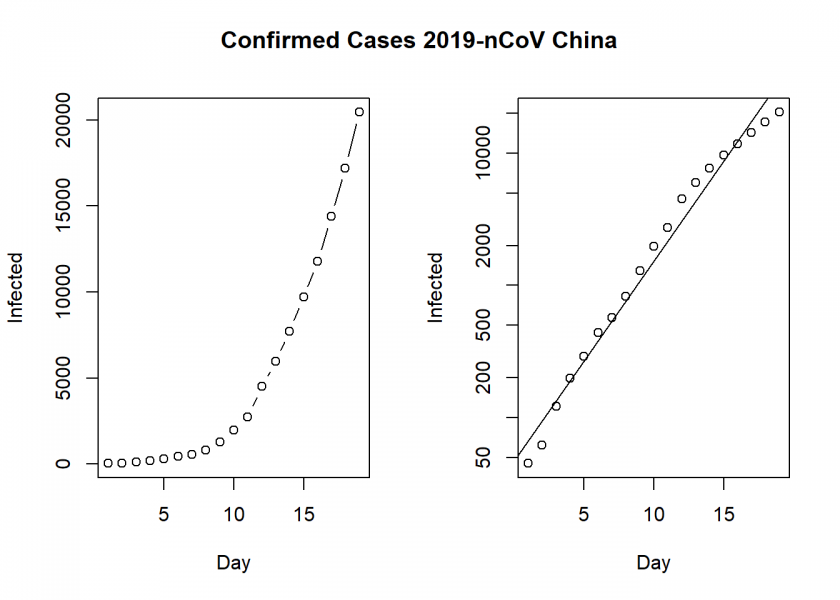
On the left, we see the confirmed cases in mainland China and on the right the same but with a log scale on the y-axis (a so-called semi-log plot or more precisely log-linear plot here), which indicates that the epidemic is in an exponential phase, although at a slightly smaller rate than at the beginning. By the way: many people were not alarmed at all at the beginning. Why? Because an exponential function looks linear in the beginning. It was the same with HIV/AIDS when it first started.
Now we come to the prediction part with the SIR model, which basic idea is quite simple. There are three groups of people: those that are healthy but susceptible to the disease ( ), the infected (
 ) and the people who have recovered (
 ):
):

To model the dynamics of the outbreak we need three differential equations, one for the change in each group, where  is the parameter that controls the transition between and and
  which controls the transition between and :
![\[\frac{dS}{dt} = - \frac{\beta I S}{N}\]](https://blog.ephorie.de/wp-content/ql-cache/quicklatex.com-d2b0ae27af38d74e8295d4741987d585_l3.png "Rendered by QuickLaTeX.com")
![\[\frac{dI}{dt} = \frac{\beta I S}{N}- \gamma I\]](https://blog.ephorie.de/wp-content/ql-cache/quicklatex.com-f8da5d245f493750bd427c7e2dd173fe_l3.png "Rendered by QuickLaTeX.com")
![\[\frac{dR}{dt} = \gamma I\]](https://blog.ephorie.de/wp-content/ql-cache/quicklatex.com-ec3fd69b48009e8ff553fb60c634ab5e_l3.png "Rendered by QuickLaTeX.com")
This can easily be put into R code:
SIR <- function(time, state, parameters) {
  par <- as.list(c(state, parameters))
  with(par, {
    dS <- -beta/N * I * S
    dI <- beta/N * I * S - gamma * I
    dR <- gamma * I
    list(c(dS, dI, dR))
    })
}
To fit the model to the data we need two things: a solver for differential equations and an optimizer. To solve differential equations the function ode from the deSolve package (on CRAN) is an excellent choice, to optimize we will use the optim function from base R. Concretely, we will minimize the sum of the squared differences between the number of infected at time  and the corresponding number of predicted cases by our model
  :
:
![\[RSS(\beta, \gamma) = \sum_{t} \left( I(t)-\^{I}(t) \right)^2\]](https://blog.ephorie.de/wp-content/ql-cache/quicklatex.com-e0c03486fba89917c27c1f7b4e76633b_l3.png "Rendered by QuickLaTeX.com")
Putting it all together:
library(deSolve)
init <- c(S = N-Infected[1], I = Infected[1], R = 0)
RSS <- function(parameters) {
  names(parameters) <- c("beta", "gamma")
  out <- ode(y = init, times = Day, func = SIR, parms = parameters)
  fit <- out[ , 3]
  sum((Infected - fit)^2)
}

Opt <- optim(c(0.5, 0.5), RSS, method = "L-BFGS-B", lower = c(0, 0), upper = c(1, 1)) # optimize with some sensible conditions
Opt$message
## [1] "CONVERGENCE: REL_REDUCTION_OF_F <= FACTR*EPSMCH"

Opt_par <- setNames(Opt$par, c("beta", "gamma"))
Opt_par
##      beta     gamma
## 0.6746089 0.3253912

t <- 1:70 # time in days
fit <- data.frame(ode(y = init, times = t, func = SIR, parms = Opt_par))
col <- 1:3 # colour

matplot(fit$time, fit[ , 2:4], type = "l", xlab = "Day", ylab = "Number of subjects", lwd = 2, lty = 1, col = col)
matplot(fit$time, fit[ , 2:4], type = "l", xlab = "Day", ylab = "Number of subjects", lwd = 2, lty = 1, col = col, log = "y")
## Warning in xy.coords(x, y, xlabel, ylabel, log = log): 1 y value <= 0
## omitted from logarithmic plot

points(Day, Infected)
legend("bottomright", c("Susceptibles", "Infecteds", "Recovereds"), lty = 1, lwd = 2, col = col, inset = 0.05)
title("SIR model 2019-nCoV China", outer = TRUE, line = -2)
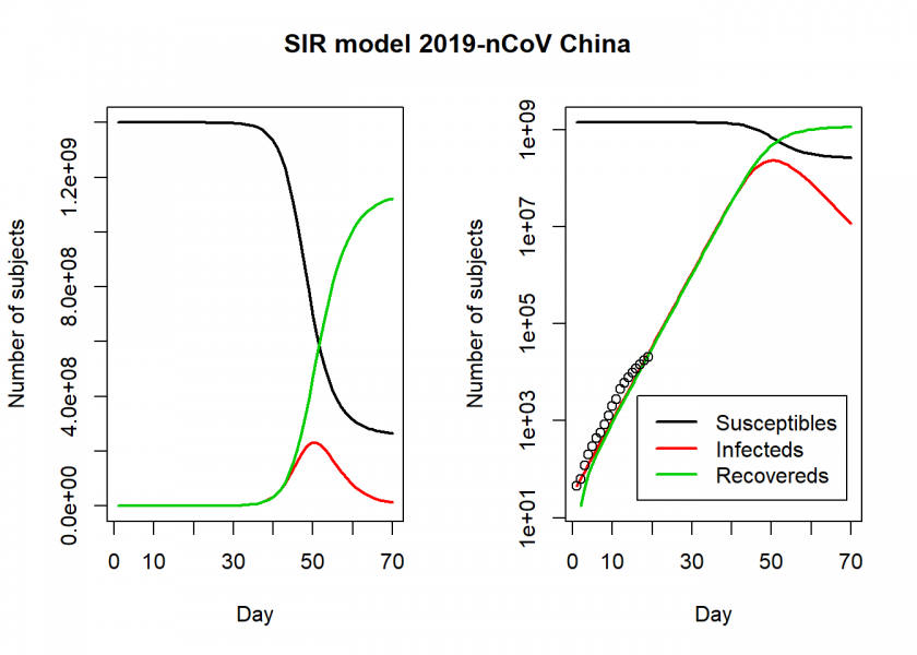
We see in the right log-linear plot that the model seems to fit the values quite well. We can now extract some interesting statistics. One important number is the so-called basic reproduction number (also basic reproduction ratio)  (pronounced “R naught”) which basically shows how many healthy people get infected by a sick person on average:
![\[R_0 = \frac{\beta}{\gamma}\]](https://blog.ephorie.de/wp-content/ql-cache/quicklatex.com-55234472b97b87e9cf3cc5b06405689f_l3.png "Rendered by QuickLaTeX.com")
par(old)

R0 <- setNames(Opt_par["beta"] / Opt_par["gamma"], "R0")
R0
##       R0
## 2.073224

fit[fit$I == max(fit$I), "I", drop = FALSE] # height of pandemic
##            I
## 50 232001865

max(fit$I) * 0.02 # max deaths with supposed 2% fatality rate
## [1] 4640037
So, is slightly above 2, which is the number many researchers and the WHO give and which is around the same range of SARS, Influenza or Ebola (while transmission of Ebola is via bodily fluids and not airborne droplets). Additionally, according to this model, the height of a possible pandemic would be reached by the beginning of March (50 days after it started) with over 200 million Chinese infected and over 4 million dead!
Do not panic! All of this is preliminary and hopefully (probably!) false. When you play along with the above model you will see that the fitted parameters are far from stable. On the one hand, the purpose of this post was just to give an illustration of how such analyses are done in general with a very simple (probably too simple!) model, on the other hand, we are in good company here; the renowned scientific journal nature writes:
Researchers are struggling to accurately model the outbreak and predict how it might unfold.
On the other hand, I wouldn’t go that far that the numbers are impossibly high. H1N1, also known as swine flu, infected up to 1.5 billion people during 2009/2010 and nearly 600,000 died. And this wasn’t the first pandemic of this proportion in history (think Spanish flu). Yet, this is one of the few times where I hope that my model is wrong and we will all stay healthy!
UPDATE March 16, 2020
I posted an updated version for the situation in Germany:
COVID-19: The Case of Germany
Problem is the data. No idea how many mild cases never seek treatment. No idea how many cases die waiting for a bed. I did see one Chinese paper a week ago where they let slip that fatalities were in the thousands. Didn’t bookmark it.
Yes, I agree, the situation is unclear (as always when something develops dynamically in real-time!)
Sorry, is it the cumulative data used in Infected? Thank you.
What would be needed are the currently infected persons (cumulative infected minus the removed, i.e. recovered or dead) but the numbers of recovered persons weren´t available at the time (to the best of my knowledge) and the difference wasn´t that big anyway because we were still in the relatively early stages (i.e. only a few recoveries).
Very nice analysis:) Did you used cumulative infected in your model i.e.
c(45, 62, 121, 198, 291, 440, 571, 830, 1287, 1975, 2744, 4515, 5974, 7711, 9692, 11791, 14380, 17205, 20440)is it representing cumulative infected persons? Can you please update how one compute mean absolute percentage error here? I tried the followingThank you.
Yes, as explained above, I used cumulative infected persons. What do you mean by “update”? I didn’t go into metrics and I don’t know the
MLmetricspackage.You may find the following guest post worthwhile: Contagiousness of COVID-19 Part I: Improvements of Mathematical Fitting (Guest Post).
Many thanks. Why don’t you use cumulative infected in your fitted SIR model? I was wondering if the data is cumulative then the red curve from the SIR model could also be cumulative in the plot. It should then looks like an S shaped curve and perhaps some more difference between actual and predicted values appears. Could you please elaborate this?
To be honest with you I don’t understand what you mean. As I said I did use cumulative infected persons, you ask me why I did not use them?!?
Hi again, I meant cumulative curve for the infected I(t)
Ah ok, now I understand. The red curve should be the cumulative infected – (cumulative dead + cumulative recovered). I used the total number of infected because the numbers of recovered weren´t available at the time (to the best of my knowledge) and the difference wasn´t that big anyway because we were still in the relatively early stages (i.e. only a few recoveries). But I explained that already…
Anyway, I hope this finally clarifies the matter
Many thanks. If I want to plot cumulative curve should I make the following change in the code?
fit[ , 3]-fit[ , 4]i.e.
matplot(fit$time, fit[ , 3]-fit[ , 4], type = "l", xlab = "Day", ylab = "Number of subjects", lwd = 2, lty = 1, col = col)Sorry for bothering as I am new to R. I would be grateful If you can please tell how to code if I want to plot the red curve for currently infected persons (cumulative infected minus the removed, i.e. recovered or dead)
You don’t have to change the code at all because the red curve reflects this already!
The model finds those values automatically (under some assumptions). The only thing that might confuse you is that I took the cumulative infected for fitting the model (without dead and recovered) but as I have said now several times the numbers of dead and recovered weren´t available at the time (to the best of my knowledge) and the difference wasn´t that big anyway because we were still in the relatively early stages (i.e. only a few recoveries) of the pandemic.
…speaking of being new to R: you might want to have a look at Learning R: The Ultimate Introduction (incl. Machine Learning!).
Hi again, I am asking this because I have included the dead and recovered in my data and I am using currently infected persons (cumulative infected minus the removed, i.e. recovered or dead). In my plot there is a clear difference between green and red curve.
Again, if you use currently infected persons for fitting the model you are doing everything right and don’t have to change anything in the code. It is to be expected that you get different curves with new, more and better data.
Thanks a lot to Prof. Holger for sharing R code to compute “basic reproduction number” i.e. Ro.
I think it is right time to calculate the “effective reproduction number” i.e. R(t) also. So, I request you to share R code for “effective reproduction number” i.e. R(t) in which one can export date wise Rt in excel sheet.
Mr. Kevin Systrom (CEO, instagram) has already calculated using python (http://systrom.com/blog/the-metric-we-need-to-manage-covid-19/) & publishing R(t) through a website (https://rt.live/). In the mean time Mr. Ramnath Vaidyanathan (VP of Product at DataCamp) has also replicated it using R (https://colab.research.google.com/drive/1iV1eRHaxirA–kmGIGbR1D67t8z8dUWN) but I could not use it to calculate R(t) for the different states of India and also could not export the day wise calculated Rt in excel sheet.
So, I am requesting you to kindly share your simplified code for the same.
With regards
Prakash Kumar Samantsinghar
Thank you, very interesting… please bear with me, but unfortunately I don’t have time to do that at the moment.
Dear Prof. Holger,
Thank you for your response. Please try to find some time to help the whole world to calculate “effective reproduction number”, so that concerned authority in govt of different states can prepare themselves. Please , try to make it possible during your free time (if possible to manage your valuable time).
With regards & thanks
Prakash Kumar Samantsinghar
Bhubaneswar, Odisha , India
Dear Prakash: Although I, of course, feel flattered by your suggestion that I could somehow help to “save the world”, I think the correct calculation of an “effective reproduction number” is one of our lesser problems.
The white elephant in the room is still the problem with data quality. The only way to get some reliable data are regular statistically representative mass tests. This idea flared up briefly in the conversation but nobody seems to be interested anymore. With unreliable data, it is the old “garbage in, garbage out”, no matter what kind of numbers you calculate.
The second big problem is that it seems that scientists aren’t part of the conversation anymore anyway. Governments seem to be keen on “reopening the economy” no matter what and scientists get death threats for telling the inconvenient truth that the pandemic is far from over.
Having said that, although I am no real authority in this field I will have another look into the matter, time permitting.
best
h
> Because an exponential function looks linear in the beginning.
Nonsense, an exponential function looks exponential at all scales. Meaning if you look at the function in real time, or if you cut any part of it, it looks exponential, not linear.
Harsh words, my friend 😉
Mathematically you are of course right but not in practice (and that is what we are dealing with here!)
See e.g. the following quote from Dr. John D. Cook, a well known applied mathematician:
“How do you know whether you’re on an exponential curve? This is not as easy as it sounds. Because of random noise, it may be hard to tell from a small amount of data whether growth is linear or exponential”.
Source: https://www.johndcook.com/blog/2008/01/17/coping-with-exponential-growth/
Another thing is that we, as humans, are not really used to exponential thinking and therefore underestimate such developments, exponential growth indeed looks linear to us in the beginning (although it is not mathematically).
Well let me apologize in advance because I agree with Dr Cook but I’m going to be annoyingly nitpicky: if the number of new cases / previous day increases every day, you are most likely on an exponential trend, if the delta of new cases is randomly greater or smaller than the previous day, then you may be on a linear growth.
So the reason is not “because the exponential function looks linear at the beginning”, but because at the start of the epidemy, there may be 0 new contamination one day, or more likely because we haven’t identified all the contaminations yet. Aka it’s a problem of lack of data which makes it very hard to identify the trend.
Yes, lack of data, data quality problems, and psychology because we, as humans, “think” linearly and not exponentially (also because the absolute change is so small at the beginning!)… which is why I think “looks linear at the beginning” might not be the best of characterizations (and is mathematically wrong!) but delivers the point concisely. Yet, in essence, we agree!
Thanks….the model looks good, simple but provides a likely road map.
Very nice analysis of an worrisome situation. I learned a great deal from your presentation and explanation. I’m accustomed to solving systems of differential equations the old fashioned way, with FORTRAN ;-), so seeing how you set this up and solved it in R, which I’m still learning, was very useful.
Now let’s all hope that your numbers are indeed incorrect, and are over-estimates.
Thank you very much for your great feedback! It is always good to see some veterans of the good ol’ days 🙂
Hello,
Thanks for posting.
With the
EpiDynamicspackage we have:All the best,
Vlad
Sorry,
Thank you! You took a mortality rate of 0.002, shouldn’t it be 0.02?
Could you perhaps post the whole code to fit the model with the
EpiDynamicspackage?How are the beta and gamma components calculated?
They are the parameters that are being optimized by
optimvia minimizing the error function RSS.Thanks for great article and quick reply.
Apologies as im not really a coder but have just started studying stats at uni.
I assumed you were inputting beta and gamma manually…
Forgive me for being dumb but im struggling to understand how you can calculate gamma from this?
Would you mind explaining for someone who is not familiar?
Thank you for your great feedback, I really appreciate it.
No, you give the optimizer some sensible starting values for beta and gamma and it then “intelligently” (some maths magic….) tries to find better and better values for both parameters which fit the given data best.
Is it clearer now?
Yes thats really helpful thank you.
My only question now would be what the beta and gamma are actually quantities of?
Also i really want to emphasise that you taking time to answer these questions is very appreciated!
These are the transition rates from S to I and from I to R in the differential equations.
Thanks for this code and your explanation.
Cross posted from Stackexchange
This is only marginally related to the detailed coding discussion, but seems highly relevant to the original question concerning modeling of the current 2019-nCoV epidemic. Please see arxiv:2002.00418v1 (paper at https://arxiv.org/pdf/2002.00418v1.pdf ) for a delayed diff equation system ~5 component model, with parameter estimation and predictions using dde23 in MatLab. These are compared to daily published reports of confirmed cases, number cured, etc. To me, it is quite worthy of discussion, refinement, and updating. It concludes that there is a bifurcation in the solution space dependent upon the efficacy of isolation, thus explaining the strong public health measures recently taken, which have a fair chance of success so far.
Thanks a lot for the amazing model. I recreated it but there is still something that I not entirely understand. The model has three states S,I,R. If I sum these states up they come to a total of N (total population) at each time point. As there are also people who (unfortunately) die. Should there not also be a D state in the model? like dD/dt = (1-gamma)*I. So that always the following is true –> N = S(t) + I(t) +R(t) + D(t)
Yes, but that doesn’t change anything mathematically. You can think of R as the pool of people who either recovered or died based on the mortality rate of the disease.
Hi
How can i create dynamic line chart and dynamic scatterplot(like gapminder) for Corona virus data???
Please help me.
I need to this plots.
Very very necessary
My gmail for answer me:m.rostami4543@gmail.com
If it is so very, very urgent I think you have done the following already:
https://lmgtfy.com/?q=Create+gapminder+like+charts+with+R
Hi, thanks a lot for this post. I have been looking for a while how to fit ode to real data.
I was wondering
– 1° Why we need 1/N in the equations. As N is constant I would assume we don’t need it and it could be implicit in the parameters.
– 2° Why we need 1/N in equations with beta but not with gamma.
– 3° So are beta and gamma really comparable (same units), given the fact that 1/N is only in the equations with beta?
I tried
– to remove 1/N in dS/dt and dI/dt and I obtained estimated values of beta and gamma of 0.
– to include 1/N in the equation of dR/dt : dR/dt=(gamma/N)*I, and it didn’t change the estimated parameters. Weird.
Sorry in advance if these are dumb questions.
This is just some scaling done for computational convenience. See also here:
https://stats.stackexchange.com/questions/446712/fitting-sir-model-with-2019-ncov-data-doesnt-conververge
Any chance you could update the model with updated data
This is not planned at the moment but you can easily do it yourself because I provide the full code above.
I found this very interesting and have been working on a presentation for undergraduates with up-to-date data, maybe some more graphics.
Some comments:
1. The package
nCov2019(remotes::install_github("GuangchuangYu/nCov2019")) was supplying up-to-date data very close to the Wikipedia table, but the time series data “x$ChinaDayList” in that package seem to have gone empty in the last couple of days. I have also tried the “rvest” package to scrape the wikipedia table. This is difficult, the format of that table changes quite often.2. In the current (2/24) Wikipedia table, Confirmed_cumulative = Active_Confirmed+Deaths_and_Recovered_cumulative except for a few record keeping differences. The Infectious (I) numbers in the SIR model should be the Active_Confirmed column, not the Confirmed_cumulative (=I+R) numbers used in your example. Interesting to note that the Active numbers have been decreasing the last few days.
3. For fitting beta and gamma, it is useful to note that Confirmed_cumulative is still less than 100000 (much less than 1.4 billion), so essentially S=N. For now we should have
with solution
So the data can only determine the difference beta-gamma. This can be done simply using regression e.g.
lm(log(Infected)~Day, timeline). One approach to getting beta used in https://kingaa.github.io/clim-dis/parest/parest.html is to guess that since 1/gamma is the typical infectious period, that 1/gamma is about 14.That the optimization converges at all for both parameters is probably a good sign the SIR model is not very accurate (maybe the quarantines are working? or the data is just bad?).
Thank you, Charles. Great that you want to take this as the basis for your teaching material!
As always, data availability and data quality are serious issues. Especially in this fast-moving situation several changes concerning what was reported when and in which format occurred. You are of course right that you have to take the infected cases only. The problem was that especially at the beginning there are several values missing in the “infected” column and the difference between the two is negligible for the time period examined.
As mentioned in the post the parameters being optimized are not stable… yet the purpose of this post was primarily educational.
Still wrong because cumulative incidence aren’t independent data. The number of cumulative cases today depends the numbers yesterday (the error spreads). Least squares need INDEPENDENT data with NORMAL distribution. You will get some fitted curve but the confidence interval (CI) calculation will be TOTTALY wrong (in reality this interval is very large). It is naive trying estimate R0 from some incidence data in the early stage of a epidemic. You need entire data (retrospective analysis) or the serial interval (if you like movies about contagious disease will remember that the protagonist ever try determine the zero patient and the first infecteds). Some people in my country (Brasil) write a preprint using your strategy and maked the same mistake:
https://arxiv.org/abs/2003.14288
SIR models are so-called compartmental models which simply means that you have different groups of people in those different compartments. So, if you only get change data, like newly infected persons, you would have to accumulate them (minus the recovered or dead for Infectious) to reach the absolute numbers in the compartments.
I agree that it would be best to have complete (retrospective) high-quality datasets, unfortunately we don’t have this luxury at the moment.
In fact, at early stage when S=N,
dS/dR=-Ro,
which gives d(I+R)/dR=Ro
Thus we may have an estimate for Ro by using early stage data, if we plot (I+R) against R and find slope of the best fit straight line.
Is that true?
The main problem is that often there is no reliable data for R, especially not at the early stages.
hello MR. Charlesin. I have question: in your lm equation, is “Infected” variable cumulative or not?
I tried your code on Diamond Princess data, taken from John Hopkins data at https://github.com/CSSEGISandData/COVID-19/tree/master/csse_covid_19_data/csse_covid_19_time_series
The fit was quite nice! I got beta = 0.4353628 and gamma= 0.1966312 for R0=2.2
That is reassuring, thank you!
These high value of gamma and beta would relate to a fast transition from susceptible to infected to recovered. Roughly about 5 days (the inverse of the gamma parameter).
I have been wondering for a longer time about such numbers. It is being said by many that the incubation time is long and can be up to 2 weeks. But if that is the case, then how can the growth be so fast if the reproduction rate is only around 2?
We must have either a high reproduction rate or a fast incubation period. But instead many reports say that both are not the case.
Another possibility (to explain the diamond princess numbers) is that what we see is not a doubling for each individual (and many generations), but more something like superspreaders. Then the pattern in the sinusoidal curve is not due to an SIR model type of transmission among multiple generations, but instead much less generations and the sinusoidal curve pattern is due to the variability of the onset of the symptoms and detection of the Covid-19.
Hey, thank you for this. I replicated for a small population it using Rami Krispins dataset. I know it’s probably not correct, but I had fun making it. You can see it here.
https://medium.com/@daniel.pena.chaves/simple-coronavirus-model-using-r-cf6b1bc93949
Very interesting! Thank you for the heads-up and the kind mention!
hey, first of all, nice post really appreciated.
So, i’m trying to use this code with updated data but the model gets weird, the curve of infected is quite to the right from the inicial infected data you used. I don’t know why, it is a parametrization problem? i just updated the number of infected.
Thank you for your feedback. There could be several reasons and I cannot give a definitive answer based on the information given… would you mind sharing your code/data?
# new data Infected <- c(45, 62, 121, 198, 291, 440, 571, 830, 1287, 1975, 2744, 4515, 5974, 7711, 9692, 11791, 14380, 17205, 20440, 24324, 28018, 31161, 34546, 37198, 40171, 42638, 44653, 59804, 63851, 66492, 68500, 70548, 72436, 74185, 74576, 75465, 76288, 76936, 77150, 77658, 78064, 78497, 78824, 79251, 79824, 80026, 80151, 80270, 80409, 80552, 80651, 80695, 80735) Day <- 1:(length(Infected)) N <- 1400000000 # population of mainland china old <- par(mfrow = c(1, 2)) plot(Day, Infected, type ="b") plot(Day, Infected, log = "y") abline(lm(log10(Infected) ~ Day)) title("Confirmed Cases 2019-nCoV China", outer = TRUE, line = -2) SIR <- function(time, state, parameters) { par <- as.list(c(state, parameters)) with(par, { dS <- -beta/N * I * S dI <- beta/N * I * S - gamma * I dR <- gamma * I list(c(dS, dI, dR)) }) } library(deSolve) init <- c(S = N-Infected[1], I = Infected[1], R = 0) RSS <- function(parameters) { names(parameters) <- c("beta", "gamma") out <- ode(y = init, times = Day, func = SIR, parms = parameters) fit <- out[ , 3] sum((Infected - fit)^2) } Opt <- optim(c(0.5, 0.5), RSS, method = "L-BFGS-B", lower = c(0, 0), upper = c(1, 1)) # optimize with some sensible conditions Opt$message ## [1] "CONVERGENCE: REL_REDUCTION_OF_F <= FACTR*EPSMCH" Opt_par <- setNames(Opt$par, c("beta", "gamma")) Opt_par ## beta gamma ## 0.6746089 0.3253912 t <- 1:100 # time in days fit <- data.frame(ode(y = init, times = t, func = SIR, parms = Opt_par)) col <- 1:3 # colour matplot(fit$time, fit[ , 2:4], type = "l", xlab = "Day", ylab = "Number of subjects", lwd = 2, lty = 1, col = col) matplot(fit$time, fit[ , 2:4], type = "l", xlab = "Day", ylab = "Number of subjects", lwd = 2, lty = 1, col = col, log = "y") ## Warning in xy.coords(x, y, xlabel, ylabel, log = log): 1 y value <= 0 ## omitted from logarithmic plot points(Day, Infected) legend("bottomright", c("Susceptibles", "Infecteds", "Recovereds"), lty = 1, lwd = 2, col = col, inset = 0.05) title("SIR model 2019-nCoV China", outer = TRUE, line = -2)Just by inspection, I guess that the problem might be that you have to take the actively infected persons and not the cumulative infected. I am guilty of having taken those values myself (see in one of the comments above) because especially at the beginning there were several values missing in the “infected” column and the difference between the two was negligible for the time period examined… but not much later where they diverge considerably!
Very interesting post! Could you explain why you specifically choose 2020-01-16 as your start date?
Thank you, I really appreciate it. Well, it was the first number of the developing sequence without gaps at the time of writing (the numbers seem to have been adapted since then).
Great very easy to understand article. Possibly redo the graphs in GGplot with CI’s etc
I know this is a really stupid thing to ask but the vector at the start of your code:
Infected <- c(45, 62, 121, 198, 291, 440, 571, 830, 1287, 1975, 2744, 4515, 5974, 7711, 9692, 11791, 14380, 17205, 20440)I assume this is NEW cases per day. Not accumulative?
It is the number of infected people at each day.
Have you thought of trying to adapt so you can run on every country for which the John Hopkins database has info?
No, not at the moment but that is actually a good idea. At the moment I only published an updated version for Germany: COVID-19: The Case of Germany.
Ah thats interesting. I’ll keep an eye out to see if you do.
Would then be interested to run a regression on it to see relationship with average temperature in these countries!
Thank you very much for this amazing work, this is very interesting.
I have a little question.
As in SIR model, 1/gamma corresponds to the duration of the infection (for one person), I would be interested in fixing gamma, to study the evolution of the outbreak according to R0.
Do you think I can use a similar Rcode that the one you use (to estimate beta et gamma), to calibrate beta (and maybe I(0)), by fixing gamma?
Thank you very much for your help!
Thank you very much for your feedback!
I don’t know if I understand correctly what you are trying to do but it seems that a direct simulation approach would be more fitting.
See e.g. here: SIR models in R
If this doesn’t solve your problem please give a little bit more context.
Thank you very much for your answer! Indeed, I got beta by simulation, so this solve my problem 🙂
I still have one little question: I am trying to get a 95% confidence interval on the number of infected (I) predicted by the model at each time. Assuming that the error is normally distributed, a 95%CI could be derived using the standard error on the estimation of I(t)… But I don’t know how to get this…
Would you have any idea to derive this 95% CI?
To be honest with you I don’t think that it makes any sense to try to give sensible error ranges.
There are too many sources of potential errors, like the number of true infections (because of the number of persons tested, availability of tests and their potential false results), the nonavailability of the recovered persons, potential instabilities in the fitting procedure, the relative oversimplicity of the model itself vs. the changing dynamics of the pandemic and so on…
So the CIs would necessarily have to be so huge that they would practically be useless.
I know this is a really stupid thing to ask but it is possible fit Italy’data at your SIR model? Assumptions would be the same? (N=60000000)
Thank you very much for this amazing work, this is very interesting.
Thank you for your feedback!
This is not a stupid question, it should not be too hard to do that. I posted an updated model for Germany with full code here: COVID-19: The Case of Germany.
The same could be done for any other country, although I am not planning to do that right now.
How to change the code and use
R0<-1,38. I want to check how the numbers changes?I wouldn’t use my code but take the code from SIR models in R and set beta and gamma appropriately.
I applied your fantastic model to Italy, but in the end I get this error:
Data_Source: https://public.flourish.studio/visualisation/1443766/?utm_source=embed&utm_campaign=visualisation/1443766
Infected
length(Infected)
Day
N
old
SIR <- function(time, state, parameters) {par <- as.list(c(state, parameters))
+ with(par, {dS <- -beta/N * I * S
+ dI <- beta/N * I * S - gamma * I
+ dR  init  RSS <- function(parameters) {names(parameters) <- c("beta", "gamma")
+ out <- ode(y = init, times = Day, func = SIR, parms = parameters)
+ fit
Opt
Opt$message
[1] "ERROR: ABNORMAL_TERMINATION_IN_LNSRCH"
Why?
Hard to say… I cannot provide support for all problems that arise with the
optimfunction. Have you tried different starting values for gamma and beta? I think it might be helpful to google the error message and see what might cause the problem:Google: ERROR: ABNORMAL_TERMINATION_IN_LNSRCH.
Sorry, I couldn’t give you more… in case you catch the error pls. come back here and tell us – Thank you!
I got the same error on Germany data and solved it changing “upper” to c(.95, .95) instead of c(1.1).
Exactly I also had to ‘play’ with the upper and lower values. In this regard, I would ask:
Can you better explain the optim () function and above all:
-What do the initial, lower and upper values represent?
-How the L-BFGS-B method works?
Thanks so much!
The LNSRCH stands for line-search.
It means that the linesearch terminated without finding a minimum. The optim function repeatingly makes a linesearch for a better optimum and goes into the direction of the gradient of the cost function (in this case the residual sum of squares).
To be honest, I do not exactly know when or why this problem exactly may occur. Maybe you are to close to the boundary, maybe the gradient is not determined accurately enough, or maybe the linesearch is using too large step sizes.
This can be changed in a control parameter. You can read about it in the the help files.
Try this:
By changing parscale to smaller values you make the algorithm make more finer steps and evaluate gradients at smaller distances.
In addition, make sure you get the `init` parameter correctly set (I imagine you changed the data, but not the starting value for the ode function). This starting value needs to be the value of S, I, and R at time zero (possibly you have the Chinese case).
Hey MArtijn,
I had the same abnormal termination message with mexican data, adding the control parameter allowed me to have convergence.
thanks for your time on explainig this issue.
Thanks for putting all of this together!
My concern is that the data that you are using for your SIR model is the cumulative number of confirmed cases. The cumulative number of confirmed cases is not equal to the current number of active cases at any point in time. The active cases would be the cumulative number minus the deaths and minus the recovered. In the SIR model I = C – R where C is the cumulative number and R is the recovered with the standard macabre caveat that a death is counted as recovered. Your code suggests that you are almost doing this as your optimizer fits the cumulative infected with the recovered R (line 10 of your code uses “fit <- out[ , 3]" which represents the predicted R. The recovered R in an SIR model will lag behind the cumulative infected. Alternatively, you could adjust your optimizer by fitting the data of the cumulative number of cases at each time point with the models predicted value of I + R at the same point in time.
A further refinement would be to enclose your system into a second optimizer that is used to pick the best starting value for I. I don't think these changes will qualitatively change your conclusions. I will play around and see what happens.
Thank you for your feedback, highly appreciated. Yes, please play around with the code and the numbers and come back to share your results with us. Thank you again!
Hi, how would it be possible to take into account the deaths?
No, not in the simple SIR model (which is technically called SIR model without vital dynamics). Having said that you can think of R not only as Recovered but as Removed which would include people having died from the disease.
Hello Prof. Holger,
Thanks a lot for this clear and inspiring entry.
I have already applied your code to monitor and forecast the evolution of the pandemic in Madrid (Spain).
In the process, I modified some of the charts you use to use ggplot way of doing that.
This is your code with the changes (please note that it is needed packages data.table and patchwork).
#--------------

#-------- Library loading
suppressPackageStartupMessages({
  library(data.table)
  library(patchwork)
  library(deSolve)
})

Infected <- c(45, 62, 121, 198, 291, 440, 571, 830, 1287, 1975, 2744, 4515, 5974, 7711, 9692, 11791, 14380, 17205, 20440)
Day <- 1:(length(Infected))
N <- 1400000000 # population of mainland china

# old <- par(mfrow = c(1, 2))
# plot(Day, Infected, type ="b")
# plot(Day, Infected, log = "y")
# abline(lm(log10(Infected) ~ Day))
# title("Confirmed Cases 2019-nCoV Madrid", outer = TRUE, line = -2)

DayInfec_df <- data.frame(
  Day = Day,
  Infected = Infected,
  logInfec = log10(Infected)
)

gr_a <- ggplot(DayInfec_df, aes( x = Day, y = Infected)) +
  geom_line( colour = 'grey', alpha = 0.25) +
  geom_point(size = 2) +
  ggtitle("Cases - China") +
  ylab("# Infected") + xlab("Day") +
  theme_bw()

gr_b <- ggplot(DayInfec_df, aes( x = Day, y = logInfec)) +
  geom_point(size = 2) +
  geom_smooth(method = lm, se = FALSE) +
  ggtitle("Cases (log) - China") +
  ylab("# Infected") + xlab("Day") +
  theme_bw()
gr_a + gr_b  +
  plot_annotation(title = 'Real Cases - Cov-19 - China',
                  theme = theme(plot.title = element_text(size = 18)))


SIR <- function(time, state, parameters) {
  par <- as.list(c(state, parameters))
  with(par, {
    dS <- -beta/N * I * S
    dI <- beta/N * I * S - gamma * I
    dR <- gamma * I
    list(c(dS, dI, dR))
  })
}

init <- c(S = N - Infected[1], I = Infected[1], R = 0)
RSS <- function(parameters) {
  names(parameters) <- c("beta", "gamma")
  out <- ode(y = init, times = Day, func = SIR, parms = parameters)
  fit <- out[ , 3]
  sum((Infected - fit)^2)
}

Opt <- optim(c(0.5, 0.5), RSS, method = "L-BFGS-B", lower = c(0, 0), upper = c(1, 1)) # optimize with some sensible conditions
Opt$message
## [1] "CONVERGENCE: REL_REDUCTION_OF_F <= FACTR*EPSMCH"
# [1] "ERROR: ABNORMAL_TERMINATION_IN_LNSRCH"..... :-(

Opt_par <- setNames(Opt$par, c("beta", "gamma"))
Opt_par
# beta     gamma
# 1.0000000 0.7127451

t <- 1:70 # time in days
fit <- data.frame(ode(y = init, times = t, func = SIR, parms = Opt_par))
col <- 1:3 # colour

# matplot(fit$time, fit[ , 2:4], type = "l", xlab = "Day", ylab = "Number of subjects", lwd = 2, lty = 1, col = col)
# matplot(fit$time, fit[ , 2:4], type = "l", xlab = "Day", ylab = "Number of subjects", lwd = 2, lty = 1, col = col, log = "y")
# ## Warning in xy.coords(x, y, xlabel, ylabel, log = log): 1 y value <= 0
# ## omitted from logarithmic plot
#
# points(Day, Infected)
# legend("bottomright", c("Susceptibles", "Infecteds", "Recovereds"), lty = 1, lwd = 2, col = col, inset = 0.05)
# par(old)

max_infe <- fit[fit$I == max(fit$I), "I", drop = FALSE]
val_max  <- data.frame(Day = as.numeric(rownames(max_infe)) ,
                       Value = max_infe$I )
val_lab  <- paste('Infected_Peak:\n', as.character(round(val_max$Value),0))
dea_lab  <- paste('Deaths (2%):\n', as.character(round(val_max$Value * 0.02,0)) )

fit_dt   <- as.data.table(fit)
fit_tidy <- melt(fit_dt, id.vars = c('time') , measure.vars = c('S', 'I','R') )
fit_gd   <- merge(fit_dt, DayInfec_df[, c(1:2)],
                  by.x = c('time'), by.y = c('Day'),
                  all.x = TRUE)
fit_all <- melt(as.data.table(fit_gd), id.vars = c('time') ,
                measure.vars = c('S', 'I','R', 'Infected') )
fit_all[ , Type := ifelse( variable != 'Infected', 'Simul', 'Real')]

gr_left <- ggplot(fit_tidy, aes( x = time, y = value,
                                 group = variable,
                                 color = variable) ) +
  geom_line( aes(colour = variable)) +
  ylab("# People") + xlab("Day") +
  guides(color = FALSE) +
  theme_bw()
gr_left

gr_right <- ggplot(fit_all, aes( x = time, y = value,
                                 group = variable,
                                 color = variable,
                                 linetype = Type) ) +
  geom_line( aes(colour = variable)) +
  # geom_point(aes(x = val_max$Day, y = val_max$Value)) +
  scale_y_log10() +
  ylab("# People (log)") + xlab("Day") +
  guides(color = guide_legend(title = "")) +
  scale_color_manual(labels = c('Susceptibles', 'Infecteds', 'Recovered','Real_Cases'),
                     values = c('red', 'green', 'blue', 'black') ) +
  theme_bw() +
  theme(legend.position = "right", legend.text=element_text(size = 6)) +
  annotate( 'text', x = val_max$Day, y = val_max$Value,
            size = 2.5, label = val_lab) +
  annotate( 'text', x = val_max$Day, y = 0.05*val_max$Value,
            size = 2.5, label = dea_lab)

gr_right

gr_left + gr_right  +
  plot_annotation(title = 'China - Projection Evolution Cov-19 (SIR Model)',
                  theme = theme(plot.title = element_text(size = 18)))

#--------------
Hope that it helps .
Kind Regards,
Carlos Ortega
Dear Carlos: Thank you very much for your great feedback and for sharing your code with the community! Highly appreciated!
How do we add uncertainty after the foretasted/ predicted period?
I think there is already enough uncertainty in the model, or what do you mean?
Hello Prof. Carlos Ortega,
I am newbie in both R & bbplot. After running the above code in R 4.0.0 with ggplot2 , following errors are displayed. Please give your suggestion to rectify this error.
> #--------------
>
> #-------- Library loading
> suppressPackageStartupMessages({
+   library(data.table)
+   library(patchwork)
+   library(deSolve)
+ })
>
> Infected  Day  N
> # old  # plot(Day, Infected, type ="b")
> # plot(Day, Infected, log = "y")
> # abline(lm(log10(Infected) ~ Day))
> # title("Confirmed Cases 2019-nCoV Madrid", outer = TRUE, line = -2)
>
> DayInfec_df
> gr_a
> gr_b  gr_a + gr_b  +
+   plot_annotation(title = 'Real Cases - Cov-19 - China',
+                   theme = theme(plot.title = element_text(size = 18)))
Error: object 'gr_a' not found
>
>
> SIR <- function(time, state, parameters) {
+   par <- as.list(c(state, parameters))
+   with(par, {
+     dS <- -beta/N * I * S
+     dI <- beta/N * I * S - gamma * I
+     dR
> init  RSS <- function(parameters) {
+   names(parameters) <- c("beta", "gamma")
+   out <- ode(y = init, times = Day, func = SIR, parms = parameters)
+   fit
> Opt  Opt$message
[1] "CONVERGENCE: REL_REDUCTION_OF_F  ## [1] "CONVERGENCE: REL_REDUCTION_OF_F  # [1] "ERROR: ABNORMAL_TERMINATION_IN_LNSRCH"..... :-(
>
> Opt_par  Opt_par
     beta     gamma
0.6746089 0.3253912
> # beta     gamma
> # 1.0000000 0.7127451
>
> t  fit  col
> # matplot(fit$time, fit[ , 2:4], type = "l", xlab = "Day", ylab = "Number of subjects", lwd = 2, lty = 1, col = col)
> # matplot(fit$time, fit[ , 2:4], type = "l", xlab = "Day", ylab = "Number of subjects", lwd = 2, lty = 1, col = col, log = "y")
> # ## Warning in xy.coords(x, y, xlabel, ylabel, log = log): 1 y value  # ## omitted from logarithmic plot
> #
> # points(Day, Infected)
> # legend("bottomright", c("Susceptibles", "Infecteds", "Recovereds"), lty = 1, lwd = 2, col = col, inset = 0.05)
> # par(old)
>
> max_infe  val_max   val_lab   dea_lab
> fit_dt    fit_tidy  fit_gd    fit_all  fit_all[ , Type := ifelse( variable != 'Infected', 'Simul', 'Real')]
>
> gr_left  gr_left
Error: object 'gr_left' not found
>
> gr_right
> gr_right
Error: object 'gr_right' not found
>
> gr_left + gr_right  +
+   plot_annotation(title = 'China - Projection Evolution Cov-19 (SIR Model)',
+                   theme = theme(plot.title = element_text(size = 18)))
Error: object 'gr_left' not found
>
> #--------------
>
With regards & thanks
Prakash
Hello Prof. Carlos Ortega
I included library(ggplot2) and now It displays – a new message & 2 warnings
(i)-New Message
geom_smooth()using formulay ~ x(ii)-2 Warning messages:
Please give any suggestion ….
> #-------- Library loading > suppressPackageStartupMessages({ + library(data.table) + library(patchwork) + library(deSolve) + }) > library(ggplot2) > > Infected Day N > # old # plot(Day, Infected, type ="b") > # plot(Day, Infected, log = "y") > # abline(lm(log10(Infected) ~ Day)) > # title("Confirmed Cases 2019-nCoV Madrid", outer = TRUE, line = -2) > > DayInfec_df > gr_a > gr_b gr_a + gr_b + + plot_annotation(title = 'Real Cases - Cov-19 - China', + theme = theme(plot.title = element_text(size = 18)))geom_smooth()using formulay ~ x> > > SIR <- function(time, state, parameters) { + par <- as.list(c(state, parameters)) + with(par, { + dS <- -beta/N * I * S + dI <- beta/N * I * S - gamma * I + dR > init RSS <- function(parameters) { + names(parameters) <- c("beta", "gamma") + out <- ode(y = init, times = Day, func = SIR, parms = parameters) + fit > Opt Opt$message [1] "CONVERGENCE: REL_REDUCTION_OF_F ## [1] "CONVERGENCE: REL_REDUCTION_OF_F # [1] "ERROR: ABNORMAL_TERMINATION_IN_LNSRCH"..... :-( > > Opt_par Opt_par beta gamma 0.6746089 0.3253912 > # beta gamma > # 1.0000000 0.7127451 > > t fit col > # matplot(fit$time, fit[ , 2:4], type = "l", xlab = "Day", ylab = "Number of subjects", lwd = 2, lty = 1, col = col) > # matplot(fit$time, fit[ , 2:4], type = "l", xlab = "Day", ylab = "Number of subjects", lwd = 2, lty = 1, col = col, log = "y") > # ## Warning in xy.coords(x, y, xlabel, ylabel, log = log): 1 y value # ## omitted from logarithmic plot > # > # points(Day, Infected) > # legend("bottomright", c("Susceptibles", "Infecteds", "Recovereds"), lty = 1, lwd = 2, col = col, inset = 0.05) > # par(old) > > max_infe val_max val_lab dea_lab > fit_dt fit_tidy fit_gd fit_all fit_all[ , Type := ifelse( variable != 'Infected', 'Simul', 'Real')] > > gr_left gr_left > > gr_right > gr_right Warning messages: 1: Transformation introduced infinite values in continuous y-axis 2: Removed 51 row(s) containing missing values (geom_path). > > gr_left + gr_right + + plot_annotation(title = 'China - Projection Evolution Cov-19 (SIR Model)', + theme = theme(plot.title = element_text(size = 18))) Warning messages: 1: Transformation introduced infinite values in continuous y-axis 2: Removed 51 row(s) containing missing values (geom_path). >with regards & thanks
Prakash
Thanks a lot to both Prof. Holger & Prof. Carlos Ortega for their beautiful codes.
I applied your codes for State Odisha(India) and added some important information in the graph. Also, added comments in the code for easy understanding of newbies like me.
###------install R 4.0.0 and following packages before running SIR Model code ------###

## vist https://www.r-project.org/  and install R 4.0.0 from it. After installation run the following codes (after removing ## which is begining of each line) one by one to install packages by selecting the CRAN near to your country.

####-------- install packages ---------------###
##install.packages("deSolve")
##install.packages("data.table")
##install.packages("patchwork")
##install.packages("ggplot2")
##install.packages("lubridate")

## Open R 4.0.0 and paste the following code ##

#-------- Library loading
suppressPackageStartupMessages({
  library(data.table)
  library(patchwork)
  library(deSolve)
  library(lubridate)
  library(ggplot2)
})

sir_start_date <- "01-06-2020" #Starting date of data input

#Input Data for Infected (i.e. Date wise Cumulative Active Cases). Following  is data for last  6days period From 1 June 2020 to 6 June 2020

Infected <- c(852,	913,	965,	990,	996,	1057) # Day wise Cumulative Active Cases = Cumulative Confirmed Cases - (Cumulative Recovered Cases + Cumulative Death Cases)
Day <- 1:(length(Infected)) # Starting date 1 June 2020
N <- 46356334  # Population of Odisha as on March 2020

DayInfec_df <- data.frame(
  Day = Day,
  Infected = Infected,
  logInfec = log10(Infected)
)

gr_a <- ggplot(DayInfec_df, aes( x = Day, y = Infected)) +
  geom_line( colour = 'grey', alpha = 0.25) +
  geom_point(size = 2) +
  ggtitle("Cumulative Active Cases-Odisha") +
  ylab("# No. of Active Infected People") + xlab("Day") +
  theme_bw()

gr_b <- ggplot(DayInfec_df, aes( x = Day, y = logInfec)) +
  geom_point(size = 2) +
  geom_smooth(method = lm, se = FALSE) +
  ggtitle("Cumulative Active Cases (log) - Odisha") +
  ylab("# No. of Active Infected People(log)") + xlab("Day") +
  theme_bw()
gr_a + gr_b  +
  plot_annotation(title = 'Cumulative Active Cases SARS-CoV-2 (2019-nCoV) Odisha',
                  theme = theme(plot.title = element_text(size = 18)))

##`geom_smooth()` using formula 'y ~ x'

 SIR <- function(time, state, parameters) {
  par <- as.list(c(state, parameters))
  with(par, {
    dS <- -beta/N * I * S
    dI <- beta/N * I * S - gamma * I
    dR <- gamma * I
    list(c(dS, dI, dR))
  })
}

init <- c(S = N - Infected[1], I = Infected[1], R = 0)
RSS <- function(parameters) {
  names(parameters) <- c("beta", "gamma")
  out <- ode(y = init, times = Day, func = SIR, parms = parameters)
  fit <- out[ , 3]
  sum((Infected - fit)^2)
}

Opt <- optim(c(0.5, 0.5), RSS, method = "L-BFGS-B", lower = c(0, 0), upper = c(1, 1)) # optimize with some sensible conditions
Opt$message
## [1] "CONVERGENCE: REL_REDUCTION_OF_F <= FACTR*EPSMCH"
## [1] "ERROR: ABNORMAL_TERMINATION_IN_LNSRCH"..... :-(

Opt_par <- setNames(Opt$par, c("beta", "gamma"))
Opt_par
# beta     	gamma
# 0.5222755 	0.4777246

t <- 1:300 # time in days
fit <- data.frame(ode(y = init, times = t, func = SIR, parms = Opt_par))
col <- 1:3 # colour

R0 <- setNames(Opt_par["beta"] / Opt_par["gamma"], "R0")
R0
##       R0
## 1.093256

fit[fit$I == max(fit$I), "I", drop = FALSE] # height of pandemic
##            I
## 152 174441.9

max_infe <- fit[fit$I == max(fit$I), "I", drop = FALSE]
val_max  <- data.frame(Day = as.numeric(rownames(max_infe)) ,
                       Value = max_infe$I )
val_lab  <- paste('Infected (Active) Peak \n', as.character(round(val_max$Value),0)) 	#No of projected cumulative Active Cases on peak day
dea_lab  <- paste('Deaths (1%):', as.character(round(val_max$Value * 0.01,0))) 		#Calculation of death cases @ 1% of cummulative active cases on peak day
rgb_lab <- paste('\n Ro =', round(Opt_par["beta"]/Opt_par["gamma"],3),'\n β =',round(Opt_par["beta"],3),'\n ϒ =',round(Opt_par["gamma"],3))  # Values rounded to decimal 3 places
start_date_lab <- format(as.Date(dmy(sir_start_date),'%d-%m-%y'), '%d-%b-%Y') 			#Convert starting date from YYYY-MM-DD to DD-MMM-YYYY
peak_date_lab <- format(as.Date(dmy(sir_start_date)+days(val_max$Day),'%d-%m-%y'), '%d-%b-%Y') 	#calculate peak date & convert it from YYYY-MM-DD to DD-MMM-YYYY
peak_day_lab <- paste(val_max$Day) 	#Number of days from the starting date to peak date

fit_dt   <- as.data.table(fit)
fit_tidy <- melt(fit_dt, id.vars = c('time') , measure.vars = c('S', 'I','R') )
fit_gd   <- merge(fit_dt, DayInfec_df[, c(1:2)],
                  by.x = c('time'), by.y = c('Day'),
                  all.x = TRUE)
fit_all <- melt(as.data.table(fit_gd), id.vars = c('time') ,
                measure.vars = c('S', 'I','R', 'Infected') )
fit_all[ , Type := ifelse( variable != 'Infected', 'Simulation', 'Real')]

gr_left <- ggplot(fit_tidy, aes( x = time, y = value,
                                 group = variable,
                                 color = variable) ) +
  geom_line( aes(colour = variable), size=1.25) +
  ylab("# No. of People") + xlab("Day") +
  guides(color=FALSE) +
  theme_bw()
gr_left

gr_right <- ggplot(fit_all, aes( x = time, y = value,
                                 group = variable,
                                 color = variable,
                                 linetype = Type) ) +
  geom_line( aes(colour = variable), size=1.25) +
  geom_point(aes(x = val_max$Day, y = val_max$Value)) +
  scale_y_log10() +
  ylab("# No. of People (log)") + xlab("Day") +
  guides(color = guide_legend(title = "legend")) +
  scale_color_manual(labels = c('Susceptible', 'Infected', 'Removed','Real Cases'),
                     values = c('red', 'green', 'blue', 'black') ) +
  theme_bw() +
  theme(legend.position = "right", legend.text=element_text(size = 10)) +
  annotate( 'text', x = val_max$Day, y = val_max$Value,
            size = 3, fontface = "bold", label = val_lab) +
  annotate( 'text', x = val_max$Day, y = 0.01*val_max$Value,
            size = 3, fontface = "bold", label = dea_lab) +
  annotate("text", x = val_max$Day, y = 0.08*val_max$Value,
            size = 3, fontface = "bold", color="red", label = rgb_lab) +
  annotate("text", x = 10, y = 0.2,
            size = 3, fontface = "bold", label = start_date_lab) +
  annotate("text", x = val_max$Day, y = 0.2,
            size = 3, fontface = "bold", label = peak_date_lab) +
  annotate("text", x = val_max$Day, y = 0.1,
            size = 3, label = peak_day_lab) +
  annotate(geom="text", x=0.5*val_max$Day, y=15*val_max$Value, label="@Prakash", colour="grey",
             size=10, fontface="bold", alpha = 0.1, angle=45)  # Watermark
#NB-Position of the above annotate should be changed as per the graph by changing x and y values.
gr_right

## Warning messages:
## 1: Transformation introduced infinite values in continuous y-axis
## 2: Removed 294 row(s) containing missing values (geom_path).

gr_left + gr_right  +
  plot_annotation(title = 'SIR Model SARS-CoV-2 (2019-nCoV) Odisha :  Lockdown Phase-5, First Week',
                  theme = theme(plot.title = element_text(hjust = 0.5, size = 18, color="black"))) +
	labs(subtitle = "First Week ( 1 June 2020 to 6 June 2020) : Unlock-1")+ theme(plot.subtitle = element_text(hjust = 0.5, size = 10, face="bold", color="brown4"))+
	labs(caption = "Data Source : https://statedashboard.odisha.gov.in/ | Graph : Prakash Kumar Samantsinghar")+ theme(plot.caption = element_text(hjust = 0.5, size = 10, face="bold", color="darkblue"))

##Warning messages:
##1: Transformation introduced infinite values in continuous y-axis
##2: Removed 294 row(s) containing missing values (geom_path).

#-------------------
With regards & thanks
Prakash Kumar Samantsinghar
The following is modified code with revised data as per source of data.
###------install R 4.0.0 and following packages before running SIR Model code ------###

## vist https://www.r-project.org/  and install R 4.0.0 from it.
##After installation of R 4.0.0 run the following codes
##(after removing ## which is begining of each line)
##one by one to install packages by selecting the CRAN near to your country.

####-------- install packages ---------------###
##install.packages("deSolve")
##install.packages("data.table")
##install.packages("patchwork")
##install.packages("ggplot2")
##install.packages("lubridate")

## Open R 4.0.0 and paste the following code ##

#-------- Library loading
suppressPackageStartupMessages({
  library(data.table)
  library(patchwork)
  library(deSolve)
  library(lubridate)
  library(ggplot2)
})

sir_start_date <- "01-06-2020" #Starting date of input data

#Input Data for Infected (i.e. Date wise Cumulative Active Cases).
#Following  is data for last  6days period From 1 June 2020 to 6 June 2020

Infected <- c(850,	911,	963,	988,	994,	1055)

# Day wise Cumulative Active Cases
# = Cumulative Confirmed Cases - (Cumulative Recovered Cases + Cumulative Death Cases)

Day <- 1:(length(Infected)) # Starting date 1 June 2020
N <- 46356334  # Population of Odisha as on March 2020

DayInfec_df <- data.frame(
  Day = Day,
  Infected = Infected,
  logInfec = log10(Infected)
)


gr_a <- ggplot(DayInfec_df, aes( x = Day, y = Infected)) +
  geom_line( colour = 'grey', alpha = 0.25) +
  geom_point(size = 2) +
  ggtitle("Cumulative Active Cases-Odisha") +
  ylab("# No. of Active Infected People") + xlab("Day") +
  theme_bw()

gr_b <- ggplot(DayInfec_df, aes( x = Day, y = logInfec)) +
  geom_point(size = 2) +
  geom_smooth(method = lm, se = FALSE) +
  ggtitle("Cumulative Active Cases (log) - Odisha") +
  ylab("# No. of Active Infected People(log)") + xlab("Day") +
  theme_bw()
gr_a + gr_b  +
  plot_annotation(title = 'Cumulative Active Cases SARS-CoV-2 (2019-nCoV) Odisha',
                  theme = theme(plot.title = element_text(size = 18)))

##`geom_smooth()` using formula 'y ~ x'

 SIR <- function(time, state, parameters) {
  par <- as.list(c(state, parameters))
  with(par, {
    dS <- -beta/N * I * S
    dI <- beta/N * I * S - gamma * I
    dR <- gamma * I
    list(c(dS, dI, dR))
  })
}

init <- c(S = N - Infected[1], I = Infected[1], R = 0)
RSS <- function(parameters) {
  names(parameters) <- c("beta", "gamma")
  out <- ode(y = init, times = Day, func = SIR, parms = parameters)
  fit <- out[ , 3]
  sum((Infected - fit)^2)
}

Opt <- optim(c(0.5, 0.5), RSS, method = "L-BFGS-B", lower = c(0, 0), upper = c(1, 1)) # optimize with some sensible conditions
Opt$message
## [1] "CONVERGENCE: REL_REDUCTION_OF_F <= FACTR*EPSMCH"
## [1] "ERROR: ABNORMAL_TERMINATION_IN_LNSRCH"..... :-(

Opt_par <- setNames(Opt$par, c("beta", "gamma"))
Opt_par
# beta     	gamma
# 0.5223230 	0.4776771

t <- 1:300 # time in days
fit <- data.frame(ode(y = init, times = t, func = SIR, parms = Opt_par))
col <- 1:3 # colour


R0 <- setNames(Opt_par["beta"] / Opt_par["gamma"], "R0")
R0
##       R0
## 1.093465

fit[fit$I == max(fit$I), "I", drop = FALSE] # height of pandemic
##            I
## 152 175161.7


max_infe <- fit[fit$I == max(fit$I), "I", drop = FALSE]
val_max  <- data.frame(Day = as.numeric(rownames(max_infe)) ,
                       Value = max_infe$I )
val_lab  <- paste('Infected Peak(Active) \n', as.character(round(val_max$Value),0)) 	#No of projected cumulative Active Cases on peak day
dea_lab  <- paste('Deaths (1%):', as.character(round(val_max$Value * 0.01,0))) 		#Calculation of death cases @ 1% of cummulative active cases on peak day
rgb_lab <- paste('\n Ro =', round(Opt_par["beta"]/Opt_par["gamma"],3),'\n β =',round(Opt_par["beta"],3),'\n ϒ =',round(Opt_par["gamma"],3))  # Values rounded to decimal 3 places
start_date_lab <- format(as.Date(dmy(sir_start_date),'%d-%m-%y'), '%d-%b-%Y') 			#Convert starting date from YYYY-MM-DD to DD-MMM-YYYY
peak_date_lab <- format(as.Date(dmy(sir_start_date)+days(val_max$Day),'%d-%m-%y'), '%d-%b-%Y') 	#calculate peak date & convert it from YYYY-MM-DD to DD-MMM-YYYY
peak_day_lab <- paste(val_max$Day) 	#Number of days from the starting date to peak date

fit_dt   <- as.data.table(fit)
fit_tidy <- melt(fit_dt, id.vars = c('time') , measure.vars = c('S', 'I','R') )
fit_gd   <- merge(fit_dt, DayInfec_df[, c(1:2)],
                  by.x = c('time'), by.y = c('Day'),
                  all.x = TRUE)
fit_all <- melt(as.data.table(fit_gd), id.vars = c('time') ,
                measure.vars = c('S', 'I','R', 'Infected') )
fit_all[ , Type := ifelse( variable != 'Infected', 'Simulation', 'Real')]

gr_left <- ggplot(fit_tidy, aes( x = time, y = value,
                                 group = variable,
                                 color = variable) ) +
  geom_line( aes(colour = variable), size=1.25) +
  ylab("# No. of People") + xlab("Day") +
  guides(color=FALSE) +
  theme_bw()
gr_left

gr_right <- ggplot(fit_all, aes( x = time, y = value,
                                 group = variable,
                                 color = variable,
                                 linetype = Type) ) +
  geom_line( aes(colour = variable), size=1.25) +
  geom_point(aes(x = val_max$Day, y = val_max$Value)) +
  scale_y_log10() +
  ylab("# No. of People (log)") + xlab("Day") +
  guides(color = guide_legend(title = "legend")) +
  scale_color_manual(labels = c('Susceptible', 'Infected', 'Removed','Real Cases'),
                     values = c('red', 'green', 'blue', 'black') ) +
  theme_bw() +
  theme(legend.position = "right", legend.text=element_text(size = 10)) +
  annotate( 'text', x = val_max$Day, y = val_max$Value,
            size = 3, fontface = "bold", label = val_lab) +
  annotate( 'text', x = val_max$Day, y = 0.01*val_max$Value,
            size = 3, fontface = "bold", label = dea_lab) +
  annotate("text", x = val_max$Day, y = 0.08*val_max$Value,
            size = 3, fontface = "bold", color="red", label = rgb_lab) +
  annotate("text", x = 10, y = 0.2,
            size = 3, fontface = "bold", label = start_date_lab) +
  annotate("text", x = val_max$Day, y = 0.2,
            size = 3, fontface = "bold", label = peak_date_lab) +
  annotate("text", x = val_max$Day, y = 0.1,
            size = 3, label = peak_day_lab) +
  annotate(geom="text", x=0.5*val_max$Day, y=15*val_max$Value, label="@Prakash", colour="grey",
             size=10, fontface="bold", alpha = 0.1, angle=45)  # Watermark
#NB-Position of the above annotate should be changed as per the graph by changing x and y values.
gr_right

## Warning messages:
## 1: Transformation introduced infinite values in continuous y-axis
## 2: Removed 294 row(s) containing missing values (geom_path).

#gr_left +
gr_right  +
  plot_annotation(title = 'SIR Model SARS-CoV-2 (2019-nCoV) Odisha :  Lockdown Phase-5, First Week',
                  theme = theme(plot.title = element_text(hjust = 0.5, size = 18, color="black"))) +
	labs(subtitle = "First Week ( 1 June 2020 to 6 June 2020 ) : Unlock-1")+ theme(plot.subtitle = element_text(hjust = 0.5, size = 8, face="bold", color="brown4"))+
	labs(caption = "Data Source : https://statedashboard.odisha.gov.in/ | Graph : Prakash Kumar Samantsinghar \n ( Using R with packages : deSolve, ggplot2, data.table, patchwork & lubridate )")+ theme(plot.caption = element_text(hjust = 0.5, size = 8, face="bold", color="darkblue"))

##Warning messages:
##1: Transformation introduced infinite values in continuous y-axis
##2: Removed 294 row(s) containing missing values (geom_path).

#-------------------
With Regards & thanks
Prakash Kumar Samantsinghar
Bhubaneswar, Odisha , India
The following is the modified code with revised data as per source of data.
New features included in the graph are :-
(i) Starting Date & Peak Date are displayed
(ii) No. of days at Peak Date displayed
(iii) Beta , Gamma & R0 displayed
(iv) Sub-title is added to specify period of data.
(v) Caption in double lines added
(vi) Watermark added
###------install R 4.0.0 and following packages before running SIR Model code ------###

## vist https://www.r-project.org/  and install R 4.0.0 from it.
##After installation of R 4.0.0 run the following codes
##(after removing ## which is begining of each line)
##one by one to install packages by selecting the CRAN near to your country.

####-------- install packages ---------------###
##install.packages("deSolve")
##install.packages("data.table")
##install.packages("patchwork")
##install.packages("ggplot2")
##install.packages("lubridate")

## Open R 4.0.0 and paste the following code ##

#-------- Library loading
suppressPackageStartupMessages({
  library(data.table)
  library(patchwork)
  library(deSolve)
  library(lubridate)
  library(ggplot2)
})

sir_start_date <- "01-06-2020" #Starting date of input data

#Input Data for Infected (i.e. Date wise Cumulative Active Cases).
# Day wise Cumulative Active Cases
# = Cumulative Confirmed Cases - (Cumulative Recovered Cases + Cumulative Death Cases)
#Following  is data for last  6days period From 1 June 2020 to 6 June 2020

Infected <- c(850,	911,	963,	988,	994,	1055)

Day <- 1:(length(Infected)) # Starting date 1 June 2020
N <- 46356334  # Population of Odisha as on March 2020

DayInfec_df <- data.frame(
  Day = Day,
  Infected = Infected,
  logInfec = log10(Infected)
)


gr_a <- ggplot(DayInfec_df, aes( x = Day, y = Infected)) +
  geom_line( colour = 'grey', alpha = 0.25) +
  geom_point(size = 2) +
  ggtitle("Cumulative Active Cases-Odisha") +
  ylab("# No. of Active Infected People") + xlab("Day") +
  theme_bw()

gr_b <- ggplot(DayInfec_df, aes( x = Day, y = logInfec)) +
  geom_point(size = 2) +
  geom_smooth(method = lm, se = FALSE) +
  ggtitle("Cumulative Active Cases (log) - Odisha") +
  ylab("# No. of Active Infected People(log)") + xlab("Day") +
  theme_bw()
gr_a + gr_b  +
  plot_annotation(title = 'Cumulative Active Cases SARS-CoV-2 (2019-nCoV) Odisha',
                  theme = theme(plot.title = element_text(size = 18)))

##`geom_smooth()` using formula 'y ~ x'

 SIR <- function(time, state, parameters) {
  par <- as.list(c(state, parameters))
  with(par, {
    dS <- -beta/N * I * S
    dI <- beta/N * I * S - gamma * I
    dR <- gamma * I
    list(c(dS, dI, dR))
  })
}

init <- c(S = N - Infected[1], I = Infected[1], R = 0)
RSS <- function(parameters) {
  names(parameters) <- c("beta", "gamma")
  out <- ode(y = init, times = Day, func = SIR, parms = parameters)
  fit <- out[ , 3]
  sum((Infected - fit)^2)
}

Opt <- optim(c(0.5, 0.5), RSS, method = "L-BFGS-B", lower = c(0, 0), upper = c(1, 1)) # optimize with some sensible conditions
Opt$message
## [1] "CONVERGENCE: REL_REDUCTION_OF_F <= FACTR*EPSMCH"
## [1] "ERROR: ABNORMAL_TERMINATION_IN_LNSRCH"..... :-(

Opt_par <- setNames(Opt$par, c("beta", "gamma"))
Opt_par
# beta     	gamma
# 0.5223230 	0.4776771

t <- 1:300 # time in days
fit <- data.frame(ode(y = init, times = t, func = SIR, parms = Opt_par))
col <- 1:3 # colour


R0 <- setNames(Opt_par["beta"] / Opt_par["gamma"], "R0")
R0
##       R0
## 1.093465

fit[fit$I == max(fit$I), "I", drop = FALSE] # height of pandemic
##            I
## 152 175161.7


max_infe <- fit[fit$I == max(fit$I), "I", drop = FALSE]
val_max  <- data.frame(Day = as.numeric(rownames(max_infe)) ,
                       Value = max_infe$I )
val_lab  <- paste('Infected Peak(Active) \n', as.character(round(val_max$Value),0)) 	#No of projected cumulative Active Cases on peak day
dea_lab  <- paste('Deaths (1%):', as.character(round(val_max$Value * 0.01,0))) 		#Calculation of death cases @ 1% of cummulative active cases on peak day
rgb_lab <- paste('\n Ro =', round(Opt_par["beta"]/Opt_par["gamma"],3),'\n β =',round(Opt_par["beta"],3),'\n ϒ =',round(Opt_par["gamma"],3))  # Values rounded to decimal 3 places
start_date_lab <- format(as.Date(dmy(sir_start_date),'%d-%m-%y'), '%d-%b-%Y') 			#Convert starting date from YYYY-MM-DD to DD-MMM-YYYY
peak_date_lab <- format(as.Date(dmy(sir_start_date)+days(val_max$Day),'%d-%m-%y'), '%d-%b-%Y') 	#calculate peak date & convert it from YYYY-MM-DD to DD-MMM-YYYY
peak_day_lab <- paste(val_max$Day) 	#Number of days from the starting date to peak date

fit_dt   <- as.data.table(fit)
fit_tidy <- melt(fit_dt, id.vars = c('time') , measure.vars = c('S', 'I','R') )
fit_gd   <- merge(fit_dt, DayInfec_df[, c(1:2)],
                  by.x = c('time'), by.y = c('Day'),
                  all.x = TRUE)
fit_all <- melt(as.data.table(fit_gd), id.vars = c('time') ,
                measure.vars = c('S', 'I','R', 'Infected') )
fit_all[ , Type := ifelse( variable != 'Infected', 'Simulation', 'Real')]

gr_left <- ggplot(fit_tidy, aes( x = time, y = value,
                                 group = variable,
                                 color = variable) ) +
  geom_line( aes(colour = variable), size=1.25) +
  ylab("# No. of People") + xlab("Day") +
  guides(color=FALSE) +
  theme_bw()
gr_left

gr_right <- ggplot(fit_all, aes( x = time, y = value,
                                 group = variable,
                                 color = variable,
                                 linetype = Type) ) +
  geom_line( aes(colour = variable), size=1.25) +
  geom_point(aes(x = val_max$Day, y = val_max$Value)) +
  scale_y_log10() +
  ylab("# No. of People (log)") + xlab("Day") +
  guides(color = guide_legend(title = "legend")) +
  scale_color_manual(labels = c('Susceptible', 'Infected', 'Removed','Real Cases'),
                     values = c('red', 'green', 'blue', 'black') ) +
  theme_bw() +
  theme(legend.position = "right", legend.text=element_text(size = 10)) +
  annotate( 'text', x = val_max$Day, y = val_max$Value,
            size = 3, fontface = "bold", label = val_lab) +
  annotate( 'text', x = val_max$Day, y = 0.01*val_max$Value,
            size = 3, fontface = "bold", label = dea_lab) +
  annotate("text", x = val_max$Day, y = 0.08*val_max$Value,
            size = 3, fontface = "bold", color="red", label = rgb_lab) +
  annotate("text", x = 10, y = 0.2,
            size = 3, fontface = "bold", label = start_date_lab) +
  annotate("text", x = val_max$Day, y = 0.2,
            size = 3, fontface = "bold", label = peak_date_lab) +
  annotate("text", x = val_max$Day, y = 0.1,
            size = 3, label = peak_day_lab) +
  annotate(geom="text", x=0.5*val_max$Day, y=15*val_max$Value, label="@Prakash", colour="grey",
             size=10, fontface="bold", alpha = 0.1, angle=45)  # Watermark

#NB-Position of the above annotate should be changed to place the values in right position
# according to the graph by changing x and y values.

gr_right

## Warning messages:
## 1: Transformation introduced infinite values in continuous y-axis
## 2: Removed 294 row(s) containing missing values (geom_path).

gr_left + gr_right  +
  plot_annotation(title = 'SIR Model SARS-CoV-2 (2019-nCoV) Odisha :  Lockdown Phase-5, First Week',
                  theme = theme(plot.title = element_text(hjust = 0.5, size = 18, color="black"))) +
	labs(subtitle = "First Week ( 1 June 2020 to 6 June 2020 ) : Unlock-1")+ theme(plot.subtitle = element_text(hjust = 0.5, size = 8, face="bold", color="brown4"))+
	labs(caption = "Data Source : https://statedashboard.odisha.gov.in/ | Graph : Prakash Kumar Samantsinghar \n ( Using R with packages : deSolve, ggplot2, data.table, patchwork & lubridate )")+ theme(plot.caption = element_text(hjust = 0.5, size = 8, face="bold", color="darkblue"))

##Warning messages:
##1: Transformation introduced infinite values in continuous y-axis
##2: Removed 294 row(s) containing missing values (geom_path).

#-------------------
With Regards & thanks
Prakash Kumar Samantsinghar
Bhubaneswar, Odisha , India
Dear Prof. Holger and Prof. Ortega,
Thank you both for sharing your code and for the excellent tutorial using this model. I applied the model to data for the US from 15 Feb 2020 through today (5 Apr 2020). Comparing the results from 3 days ago to the data through today, I was encouraged to see a slight departure from the expected logarithmic growth in number of infected cases, hopefully suggesting a slowing. However, the model seems to predict the peak coming around April 30, over 24 million infections at the peak, and nearly 488,000 deaths, which seems to be a good bit more than the worst CDC projections. Could this model be overpredicting these outcomes?
Many thanks!
We all hope that the model turns out to be wrong (i.e. the measures taken work)!
Thanks for this article!
Regarding the Infected vector, can you confirm that it should be the cumulative number of active cases instead of the cumulative number of confirmed cases?
Thanks in advance for your reply.
Best,
Antoine
Thank you, Antoine: Yes, I can confirm that it should be the cumulative number of active cases, although the numbers are hard to come by because recovered persons are often not reported (or even more unreliable than confirmed cases), so you often have to make certain assumptions concerning how long an infection will last etc.
Thanks a lot!
Hi I don’t think you should use the cumulative number of cases as “infected” in your model to fit to, but the actual incidence of (daily) cases,; notice that your infected curve in the SIR simulation is not cumulative at all, so they should match I suppose. Can you please verify and modify if needed. thanks
Thank you, this question has now been answered several times, please read through the comments. If anything is still unclear please come back!
ok thanks for your reply, I had read and seen some reflections on the topic, someone from Brazil made a relevant comment. I am an epidemiologist working for vaccines development and cannot imagine a scenario where using cumulative infection incidence data is the good thing to do and I caution against it.
But allow me to give you suggestions. In most epidemics it is difficult to determine how many new infectives there are every day since only those that are removed can be counted. Public health records generally give the number of removed per day, therefore you fit against that variable you will have better accuracy and here you can use the cumulative data. In addition, something related to statistics and not epi, instead of minimizing the (infected(recovered)-fitted), using the D statistics of the Kolmogorov–Smirnov test can be more optimal
Thank you for your suggestions! You might be interested in this post: Contagiousness of COVID-19 Part I: Improvements of Mathematical Fitting (Guest Post).
Again to your point which numbers to use: you should use the number of people that are infectious at the moment, so cumulative is meant in the sense of the sum of those people, contrary to the delta of new infections per day. Hope this clarifies the matter.
Hello,
Thanks for posting.
Why you used (0.5, 0.5) as initial for beta and gamma in optim function ???
I used (0.1, 0.1) and I got different result as below:
beta = 0.35695725,
gamma = 0.07144923,
R0: 4.99595646
As I wrote, the fitting process is not stable: you might be interested in this post: Contagiousness of COVID-19 Part I: Improvements of Mathematical Fitting (Guest Post).
I hope you are fine. In some studies, I have witnessed that the cumulative active number is being used instead of using the daily infected number for infected numbers, I. This cumulative active number = the total number of infected cases – (the total number of deaths + the total number of recovered). In my opinion, the cumulative active number should be used for the infected number, I. I would be pleased if you kindly provide your valuable opinion on this matter.
Yes, that is correct.
Professor Martijn,
Thanks a lot!
I am Professor Holger von Jouanne-Diedrich but you are very welcome!
Dear Professor Holger,
I apologize for the mistake and thank you very much.
No problem! Everything is fine.
Thank you very much for sharing the code.
When using the code for a population less than 110000 the gamma value is zero. How can I find the gamma value for smaller populations?
I think it is not necessarily dependant on the population size but the fitting process per se is tricky. You might find this guest post helpful: Contagiousness of COVID-19 Part I: Improvements of Mathematical Fitting (Guest Post).
Good Morning!
I would like to know how the RSS works for the basic SEIR model.
Thanks,
Julio Silva.