

Not many people understand the financial alchemy of modern financial investment vehicles, like hedge funds, that often use sophisticated trading strategies. But everybody understands the meaning of rising and falling markets. Why not simply translate one into the other?
If you want to get your hands on a simple R script that creates an easy-to-understand plot (a profit & loss profile or payoff diagram) out of any price series, read on!
Once again we will stand on the shoulders of giants by using the mighty quantmod package (on CRAN) and a not so well-known function from Base R, scatter.smooth (to run the code you must have R ≥ 4.1.0 installed):
library(quantmod)
## Loading required package: xts
## Loading required package: zoo
##
## Attaching package: 'zoo'
## The following objects are masked from 'package:base':
##
##     as.Date, as.Date.numeric
## Loading required package: TTR
## Registered S3 method overwritten by 'quantmod':
##   method            from
##   as.zoo.data.frame zoo

loessplot <- function(comp, benchm) {
  data <- merge(benchm, comp, all = FALSE) |> ROC() |> coredata() |> na.omit() |> data.frame()
  names(data) <- c("benchmark", "comparison")

  with(data, scatter.smooth(benchmark, comparison, evaluation = 200, xlab = names(benchm), ylab = names(comp), main = paste("Profit & Loss Profile, Correlation:", benchmark |> cor(comparison) |> round(2)), lpars = list(col = "red", lwd = 3)))
  abline(h = 0); abline(v = 0); abline(0, -1); abline(0, 1, col = "blue")
}
What this code, i.e. the loessplot function, does is to create a scatter plot from the respective price series and a benchmark (normally an index to compare it with) and superimpose a payoff diagram. The payoff diagram is created by a local regression, or more precisely locally estimated scatterplot smoothing or LOESS. LOESS can be seen as a generalization of polynomial regression which is itself a generalization of linear regression, that is closely related to correlation (the correlation coefficient is additionally provided in the title of the plot to give some context).
It is best explained by showing a few examples. Let us start with a simple index tracker of the S&P 500:
SP500 <- getSymbols("^GSPC", auto.assign = FALSE)
## 'getSymbols' currently uses auto.assign=TRUE by default, but will
## use auto.assign=FALSE in 0.5-0. You will still be able to use
## 'loadSymbols' to automatically load data. getOption("getSymbols.env")
## and getOption("getSymbols.auto.assign") will still be checked for
## alternate defaults.
##
## This message is shown once per session and may be disabled by setting
## options("getSymbols.warning4.0"=FALSE). See ?getSymbols for details.

getSymbols("IVV") # iShares Core S&P 500 ETF
## [1] "IVV"

loessplot(IVV$IVV.Adjusted, SP500$GSPC.Adjusted)

On the x-axis we have the benchmark, in this case the S&P 500, the y-axis shows the performance of the ETF. The blue line in the diagram signifies a perfect replication of the underlying, while the red line is the average payoff profile of the price series for each market phase. We can see that the tracking error is quite small, the nearly perfect positive correlation corroborates this.
It is common wisdom that combining stocks with bonds can be worthwhile. Let us have a look at their profit & loss profile:
getSymbols("TLT") # iShares 20+ Year Treasury Bond ETF
## [1] "TLT"

loessplot(TLT$TLT.Adjusted, SP500$GSPC.Adjusted)
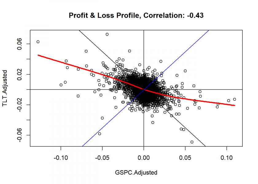
We can clearly see that they are, certainly not perfectly, but reasonably negatively correlated. So a combination is indeed a good idea.
How about gold:
Gold <- getSymbols("GC=F", auto.assign = FALSE)
## Warning: GC=F contains missing values. Some functions will not work if objects
## contain missing values in the middle of the series. Consider using na.omit(),
## na.approx(), na.fill(), etc to remove or replace them.

loessplot(Gold$`GC=F.Adjusted`, SP500$GSPC.Adjusted)
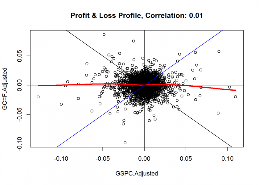
No correlation whatsoever! So, adding it to a portfolio is also a good idea diversification-wise.
Now for a more complicated trading-strategy based on the Nasdaq 100:
getSymbols("^NDX") # Nasdaq 100
## [1] "^NDX"

getSymbols("NUSI") # Nationwide Risk-Managed Income ETF
## [1] "NUSI"

loessplot(NUSI$NUSI.Adjusted, NDX$NDX.Adjusted)
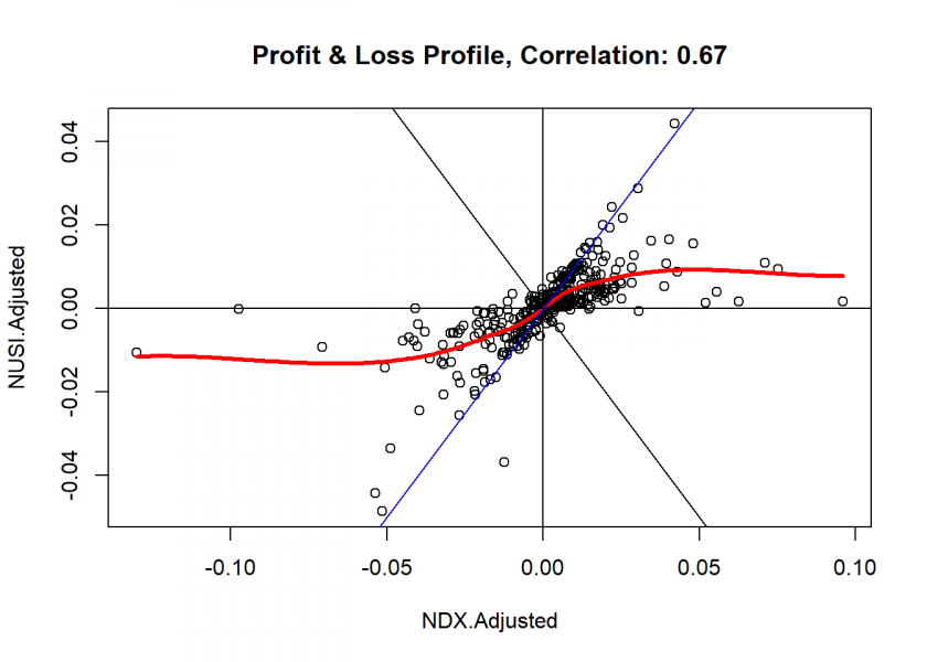
This is indeed an interesting profile: Losses are capped beyond a certain point – as are profits. The typical profile of a well-known options strategy, a so-called collar: holding an underlying, buying an out-of-the-money put option, and selling an out-of-the-money call option. Even without reading any further documents about or from this fund, we can clearly dissect their trading strategy: financial X-rays!
Let us examine another hedge fund strategy ETF:
getSymbols("QMN") # iM DBi Hedge Strategy ETF
## [1] "QMN"

loessplot(QMN$QMN.Adjusted, SP500$GSPC.Adjusted)
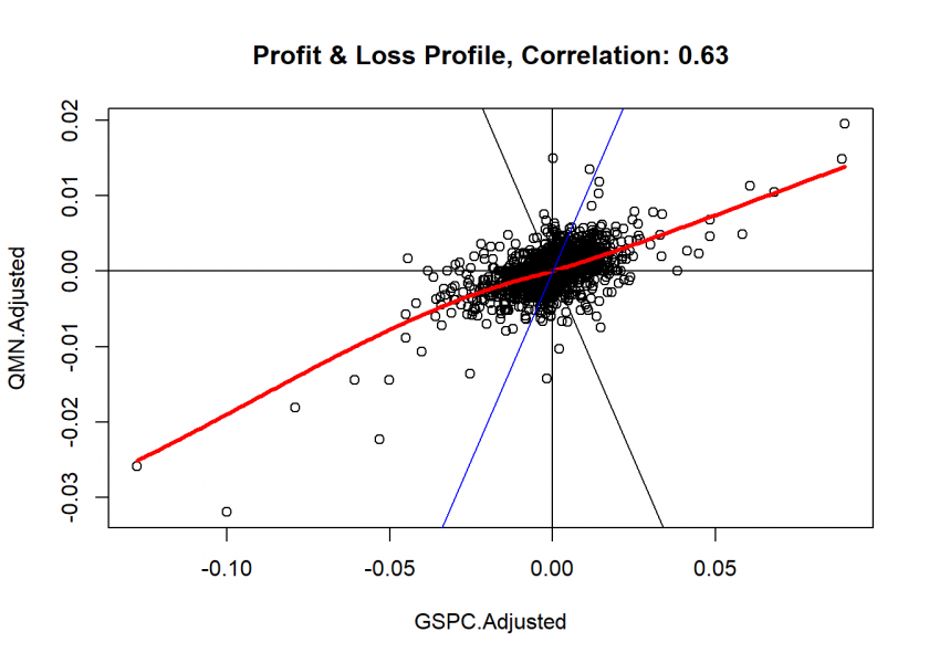
Well, this doesn’t look too impressive: while holding this fund might be quite expensive (which I don’t know) a similar profile should also be achievable by investing just about 60% of your money in a cheap index tracker (like the one seen at the beginning of this post)!
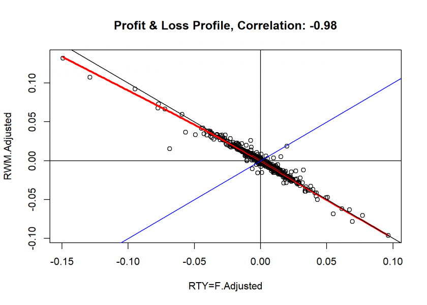
To make our little collection complete there are of course also instruments with which you can short the market, in this case the Russell 2000-index:
Russell2000 <- getSymbols("RTY=F", auto.assign = FALSE)
## Warning: RTY=F contains missing values. Some functions will not work if objects
## contain missing values in the middle of the series. Consider using na.omit(),
## na.approx(), na.fill(), etc to remove or replace them.

getSymbols("RWM") # ProShares Short Russell2000
## [1] "RWM"

loessplot(RWM$RWM.Adjusted, Russell2000$'RTY=F.Adjusted')
I will end this post with – of course – Bitcoin! As a benchmark we take the S&P 500 again:
BTC <- getSymbols("BTC-USD", auto.assign = FALSE)
## Warning: BTC-USD contains missing values. Some functions will not work if
## objects contain missing values in the middle of the series. Consider using
## na.omit(), na.approx(), na.fill(), etc to remove or replace them.

loessplot(BTC$'BTC-USD.Adjusted', SP500$GSPC.Adjusted)
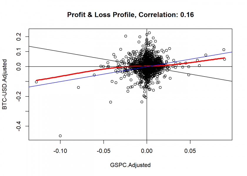
As you can see it is nearly uncorrelated – but not entirely. In this respect, gold seems to be a better alternative. And considering that gold will be there even if the lights go out and doesn’t have such an abysmal CO2 footprint underscores this: Bitcoin is like gold – only worse!
I hope that you find this useful and I would love if you could share some of your own analyses with us in the comments below.
The next logical step would be to consider replicating the found payoff structures, especially of high-cost hedge funds in a cost-effective manner. I published another post some time ago on how to do just that: Financial Engineering: Static Replication of any Payoff Function.
DISCLAIMER
This post is written on an “as is” basis for educational purposes only and comes without any warranty. The findings and interpretations are exclusively those of the author and are not endorsed by or affiliated with any third party.
In particular, this post provides no investment advice! No responsibility is taken whatsoever if you lose money.
(If you make any money though I would be happy if you would buy me a coffee… that is not too much to ask, is it? 😉 )
The function gives an error message (unfortunately in french!):
> loessplot(IVV$IVV.Adjusted, SP500$GSPC.Adjusted)
Erreur dans names(data) <- c("benchmark", "comparaison") :
  attribut 'names' [2] doit être de même longueur que le vecteur [0]
Jacques
Sorry, my fault. No error now.
Thanks
Jacques
No problem, Jacques.
If anything else shows up, please let me know.