

Over one billion dollars have been spent in the US to split up big schools into smaller ones because small schools regularly show up in rankings as top performers.
In this post, I will show you why that money was wasted because of a widespread (but not so well known) statistical artifact, so read on!
Why do small schools perform better? Many are quick to point out that an intimate, family-like atmosphere helps facilitate learning and smaller units can cater more to the special needs of their pupils. But is this really the case?
Let us conduct a little experiment where we distribute randomly performing pupils on one thousand schools, where half of them are big and the other half small. To be clear: we distribute those pupils by chance alone so that every school should have the same shot at getting top, average-, and low performers!
As a proxy for performance let us just take the intelligence quotient (IQ) which is defined to be normally distributed with a mean of 100 and a standard deviation of 15.
Let us now have a look at the fifty best performing schools:
n <- 1000 # no of schools
sm <- 50 # no of pupils small school
bg <- 1000 # no of pupils big school

set.seed(12345)
small <- matrix(rnorm(n/2 * sm, mean = 100, sd = 15), nrow = n/2, ncol = sm)
big <- matrix(rnorm(n/2 * bg, mean = 100, sd = 15), nrow = n/2, ncol = bg)

df_small <- data.frame(size = "small", performance = rowMeans(small))
df_big <- data.frame(size = "big", performance = rowMeans(big))

df <- rbind(df_small, df_big)

df_order <- df[order(df$performance, decreasing = TRUE), ]
df_order |> head(50)
##      size performance
## 296 small    106.3838
## 464 small    105.9089
## 128 small    105.5734
## 146 small    105.2287
## 36  small    104.9394
## 479 small    104.7963
## 406 small    104.7407
## 126 small    104.7316
## 386 small    104.6500
## 15  small    104.6092
## 183 small    104.5761
## 492 small    104.5029
## 106 small    104.5003
## 330 small    104.3905
## 456 small    104.2457
## 84  small    104.2373
## 474 small    104.1203
## 89  small    103.9073
## 315 small    103.7264
## 108 small    103.5928
## 19  small    103.5878
## 268 small    103.5433
## 435 small    103.4099
## 481 small    103.2921
## 70  small    103.2447
## 110 small    103.2089
## 96  small    103.1939
## 497 small    103.1700
## 103 small    103.1609
## 262 small    103.1533
## 33  small    103.1376
## 293 small    103.1008
## 252 small    103.0873
## 240 small    103.0657
## 170 small    103.0553
## 220 small    103.0485
## 185 small    103.0196
## 195 small    103.0042
## 98  small    102.9625
## 294 small    102.9349
## 51  small    102.9339
## 317 small    102.9308
## 403 small    102.9258
## 202 small    102.9255
## 463 small    102.9072
## 321 small    102.8631
## 124 small    102.8468
## 380 small    102.8341
## 273 small    102.8147
## 217 small    102.8005
In fact, all of them are small! How is that possible?
You are in for another surprise when you also look at the fifty worst performers:
df_order |> tail(50)
##      size performance
## 221 small    97.43354
## 271 small    97.43122
## 420 small    97.42636
## 77  small    97.40313
## 141 small    97.38554
## 192 small    97.38214
## 45  small    97.36123
## 331 small    97.35636
## 133 small    97.15977
## 400 small    97.12790
## 350 small    97.09748
## 161 small    96.97677
## 395 small    96.97156
## 17  small    96.95732
## 50  small    96.94013
## 353 small    96.77378
## 376 small    96.63066
## 140 small    96.60068
## 80  small    96.59475
## 115 small    96.56996
## 362 small    96.52821
## 16  small    96.35869
## 344 small    96.29919
## 290 small    96.23309
## 41  small    96.21083
## 246 small    96.13112
## 345 small    96.06559
## 104 small    96.03273
## 425 small    96.02648
## 32  small    96.01366
## 7   small    95.99434
## 364 small    95.99399
## 397 small    95.95282
## 374 small    95.92229
## 18  small    95.80126
## 184 small    95.73809
## 127 small    95.65754
## 270 small    95.60595
## 356 small    95.39492
## 433 small    95.33532
## 475 small    95.30683
## 66  small    95.30076
## 445 small    94.94566
## 61  small    94.88395
## 500 small    94.85970
## 442 small    94.85128
## 6   small    94.56465
## 347 small    94.43273
## 261 small    94.23249
## 171 small    93.82268
Again, all of them are small! The following plot reveals the overall pattern:
(df_order$performance - 100) |> barplot(main = "Sorted relative performance of schools", col = ifelse(df_order$size == "small", "blue", "red"), border = NA)
abline(h = 0)
legend("bottomleft", legend = c("Small schools", "Big schools"), fill = c("blue", "red"), bty = "n")
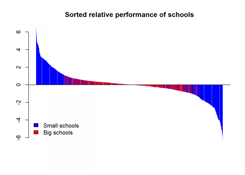
The statistical effect at work here is what my colleague Professor Howard Wainer from the University of Pennsylvania coined “The Most Dangerous Equation” in an article in the renowned American Scientist.
To understand this let us first look at some statistical measures:
summary(df_small$performance)
##    Min. 1st Qu.  Median    Mean 3rd Qu.    Max.
##   93.82   98.59  100.06  100.01  101.42  106.38

summary(df_big$performance)
##    Min. 1st Qu.  Median    Mean 3rd Qu.    Max.
##   98.58   99.71  100.02   99.99  100.32  101.19
We can see that, while both have the same mean performance, the performance variation is bigger for small schools than for big ones where the extreme cases are averaged out. De Moivre’s equation gives the exact relation in connection to the sample size, i.e. the number of pupils in this case:
![\[\sigma_{\bar x}=\sigma/\sqrt{n}\]](https://blog.ephorie.de/wp-content/ql-cache/quicklatex.com-f3f2995a55ba60abe70b18e3f2d33e54_l3.png "Rendered by QuickLaTeX.com")
where  is the standard error of the mean,
  is the standard deviation of the sample and
  is the size of the sample.
Let us calculate those numbers for our little example and compare them to the actual standard deviations of the school performance:
sd(df_small$performance)
## [1] 2.144287

15 / sqrt(sm)
## [1] 2.12132

sd(df_big$performance)
## [1] 0.4677121

15 / sqrt(bg)
## [1] 0.4743416
We can see that those numbers fit very well.
Basically, de Moivre’s equation tells us that the smaller the sample size (= the number of pupils per school) the bigger the variation (= standard error/standard deviation) which results in the effect that small schools inhabit both extremes of the performance rankings. When you only look at the top performers you will falsely conclude that you have to split up big schools!
In fact, later studies (which took this effect into account) even found that larger schools are better performing after all because they are able to offer a wider range of classes with teachers who can focus on fewer subjects. The “de Moivre”-effect was hiding this and turned it on its head!
Other examples of this widespread effect include:
- Disease rates in small and big cities, e.g. for cancer or COVID-19 infections. Small cities simultaneously lead and lag statistics compared to large cities. Sometimes even one single case can make all the difference.
- Traffic safety rates: same here, small cities are at each end of the spectrum.
- Quality of hospitals: regularly small houses end up being at the top and at the bottom.
- Mutual fund performance: there are often large swings in the performance of small funds which lets them show up in rankings on both extremes.
- …and the list goes on and on.
Of course, commentators are always fast to find reasons for each extreme, e.g. in the case of cancer rates: either “clean living of the rural lifestyle — no air pollution, no water pollution, access to fresh food without additives”, and so on vs. “poverty of the rural lifestyle — no access to good medical care, a high-fat diet, and too much alcohol and tobacco”, where in fact both results are mainly due to the statistical artifact explained by de Moivre’s equation!
This equation is so dangerous exactly because people don’t know it yet its effects are so far-reaching.
Another example of what can be called “Only looking at the winners-fallacy” can be found here: How to be Successful! The Role of Risk-taking: A Simulation Study. For another interesting fallacy due to sampling see: Collider Bias, or Are Hot Babes Dim and Eggheads Ugly?.
Do you have other examples where the “de Moivre”-effect creeps up? Please share your thoughts in the comments.
UPDATE January 5, 2023
I created a video for this post (in German):
Thanks for illustrating this effect so nicely and effectively!
Your simulation might be a good exercise for students of statistics. I recently came across a paper by Yanai and Lercher (2020) where they hid a gorilla in a data set that they asked students to analyse. If they made a simple scatter plot they would have found it, but many didn’t. The researchers found that students who were not given a specific hypothesis to test would explore the data more, and thus find the gorilla. Similarly, I imagine that people might stop exploring the IQ x school size data when they found that the best performing schools were small schools, and not notice what you show here, that they are also the worst schools.
Yanai, I., & Lercher, M. (2020). A hypothesis is a liability. Genome Biology, 21(1), Article 1. https://doi.org/10.1186/s13059-020-02133-w
Very interesting, thank you Håvard!
I the paper on my reading list. You might be interested in the following post: Causation doesn’t imply Correlation either (with the infamous datasaurus). It is quite an ingenious idea to let students find it, I think I will try this 😉
Wait — is the fallacy here the statistics or that the reviewing agencies are just looking at the TOP performing schools and comparing their size (I don’t know the answer). Because if the reviewing agencies simply looked at averages across small/large school groups, they would seem to balance out, because small schools are at both ends of the spectrum, right? If so, this would not really be a statistical issue but one of interpretation.
School classes typically consist of 25 pupils, so in a random class you have an even bigger spread than in the small school example, but if you’d compare classes in big and small schools they should be identical except for comfort factors such as the ones mentioned (“atmosphere helps facilitate learning and smaller units can cater more to the special needs of their pupils”)–I guess what I try to say is that focusing on means over larger and smaller samples is simply comparing apples and oranges.
Once again a very interesting analysis through simulation. Thanks for highlighting that. Having this in mind what do or other readers think to do to analyze the effect of class size on school performance?
Perfect would be something like an experiment, putting randomly pupils into classes of different size. Thereby checking for balanced school performance in classes and controlling for “all” other things that should have an effect on school performance (through a suitable test) (how and what to teach, teacher, school, IQ endowments of pupils, effort of parents, etc.) and then checking after a year how school performance evolved for different size classes.